Terrible interface
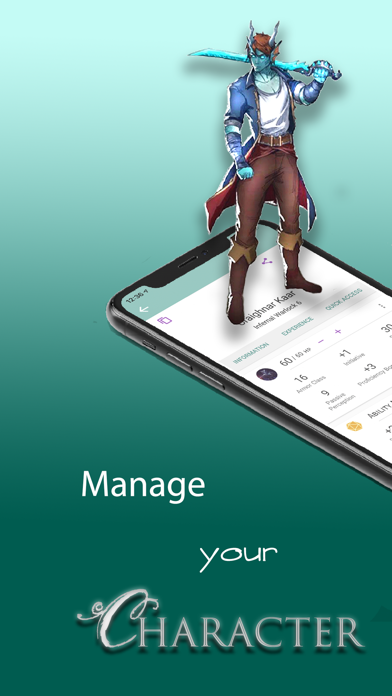
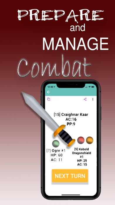
It’s completely unacceptable to have a UI this bad. Go read “Don’t Make Me Think” and sort the atrocious UI out. Things are unclear all over the place. Element are grouped under incorrect headers. Eg. Language and Favoured Enemies are all grouped under the Languages headers. The devs kind of know how drop-down menus work but only half the time. The HP meter doesn’t work properly. Levelling doesn’t work properly, the point buy system doesn’t work properly. Who saw skill points on the point buy screen going below zero and thought that was okay to ship. Just basic coding errors all over the place. It’s extremely disappointing since this app has all the content you can’t get in D&D Beyond. You have all this great content effectively served in a toilet.

