Very frustrating design.
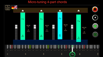
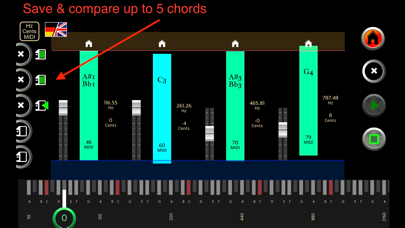
When tuning notes, the mechanism is a sliding touch button, with extremely fine increments, by cent. It is extremely frustrating because it’s very hard to get it to the exact pitch you want. There is no keypad or touch button for it, it is only a sliding touch button. It is extremely time-consuming, and ruins the otherwise interesting app. It’s a shame, because it’s a very good idea. But extremely careless design in user interface!


