I can’t believe it’s free
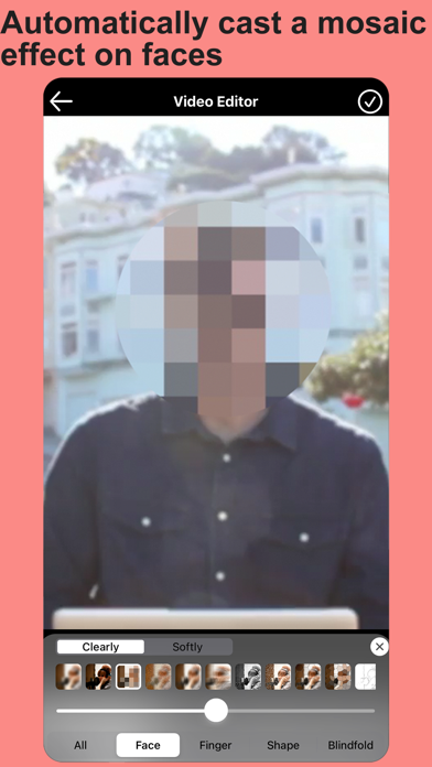
It is so easy to blur faces with this app.
Ja, Blur Video & Mosaic ist kostenlos herunterzuladen, enthält jedoch In-App-Käufe oder Abonnements.
🤔 Die Qualität der Blur Video & Mosaic-App ist gemischt. Einige Nutzer sind zufrieden, während andere Probleme melden. Ziehen Sie in Betracht, einzelne Bewertungen für mehr Kontext zu lesen.
Blur Video & Mosaic bietet mehrere In-App-Käufe/Abonnements, der durchschnittliche In-App-Preis beträgt 13.91 $.
Um geschätzte Einnahmen der Blur Video & Mosaic-App und weitere AppStore-Einblicke zu erhalten, können Sie sich bei der AppTail Mobile Analytics Platform anmelden.
4.55 von 5
4,187 Bewertungen in Vereinigte Staaten
It is so easy to blur faces with this app.
i’ve been using this for a long time for videos but now every video ends up looking super bright, bad, & botched. doesn’t matter how i save it , they still do it
This app has an issue with keeping frames separate. I just spent 20 minutes on a 30 SECOND video clip trying to blur out someone’s face before I eventually gave up. I’m constantly having issues where “blur” I placed in a particular area, moves from where I originally placed it when I rewind while editing or replay the entire project. It’s as if the app can’t determine certain frames are separate and different, so it’ll undo what I originally did and applies whatever edits I do in the next frame to the previous frame. The same thing can be said for the “eye” feature that hides or make the blur visible. In one frame, I’ll hide the blur and then in the next frame, I’ll unhide the blur. The feature continues to combine the two separate frames into one, making it impossible to blur in one frame and un-blur in the next. Overall I’ll say, if precision is what you need, it’s not here until the issues I’ve listed are fixed and resolved. Even the automatic face blur and blindfold features have issues locking on to a target that’s constantly moving frame by frame.
This app is very jankity. The whole UI is poorly made and it’s very difficult and annoying to use.
i really like this app but it’s heart shattering when you’ve been editing for over an hour then one wrong move can get your entire video deleted.
I really love the app, it’s very useful and very efficient. But as of the month of July in 2023, it’s been running a little slowly. Please fix it, thanks.
Love it. I don’t even do reviews but had to for this app.
Updated Review: Thanks for updating the icon! Now the app doesn’t look out of place! Nice to see when developers listen to feedback and “try” to implement said feedback into real life changes! My rating has raised from 3/5 stars to 4/5 stars. Original Review w/ grammar changes: I rarely ever judge a book by its cover, but I almost did when I saw this app next to other competing apps in the App Store. I’m glad I didn’t because it’s a pretty solid app “for my needs” but if I’m being honest, the icon isn’t doing it any favors and I know if I almost passed it up based on the icon’s design alone, I’m pretty sure others have or almost did like myself. You can’t help but to think about those shady looking apps that get banned every year from many different platforms when you look at this app. It looks so out of place next to other apps in the App Store and next to apps in people’s devices. With that being said, let me clarify something… I’m not trying to come off disrespect to the designer in this review and if that’s how it feels, please know this isn’t my intentions, I apologize if it came across that way, and I’m only trying to provide a consumer’s point of view when browsing for legitimate apps. Sometimes LESS is more, just take a look at Apple’s apps and other major companies’ apps, they have a minimalistic design where there’s not too many colors or special effects in the design (if any) and their whole design fits within the required measurement guidelines provided by the app store. Last but not least, the developer’s name is another thing that made me question whether or not to download this app. That could also be revamped to help bring in more downloads. Maybe something more professional looking (on paper) that people will definitely remember and recognize when they see your products and services. I hope this feedback helps! Response Update to Developer: Yes, there’s other improvements that could be done with the user interface. For instance, the ads could be modernized to video ads which are “temporary” whenever a user goes to a different section within the app, instead of the current outdated one that takes up unnecessary space in the UI all the time. The “other apps” section, could be moved to a hamburger styled menu button at the top right or top left corner of the screen to provide a cleaner look and give you more surface area to play with (when needed). I also think the background should be one solid color that represents as the main color
My subscription ends in Dec 21st and I won’t be renewing. The old app was better for blurring. Using the video to slide with your finger was much better. You have the control. This new one is too fast and it doesn’t blur slowly. Too bad, I’ve had this for a few years. Completely redesigned it. Bye!
Bought the premium package, when I selected a video to edit it just reverts back to the home page and doesn’t load the actual video.
Diagramm
|
Kategorie
|
Rang
|
---|---|---|
Top Kostenlos
|
|
109
|
Top Kostenlos
|
|
164
|
Top Kostenlos
|
|
333
|
Top Kostenlos
|
|
362
|
Top Kostenlos
|
|
375
|