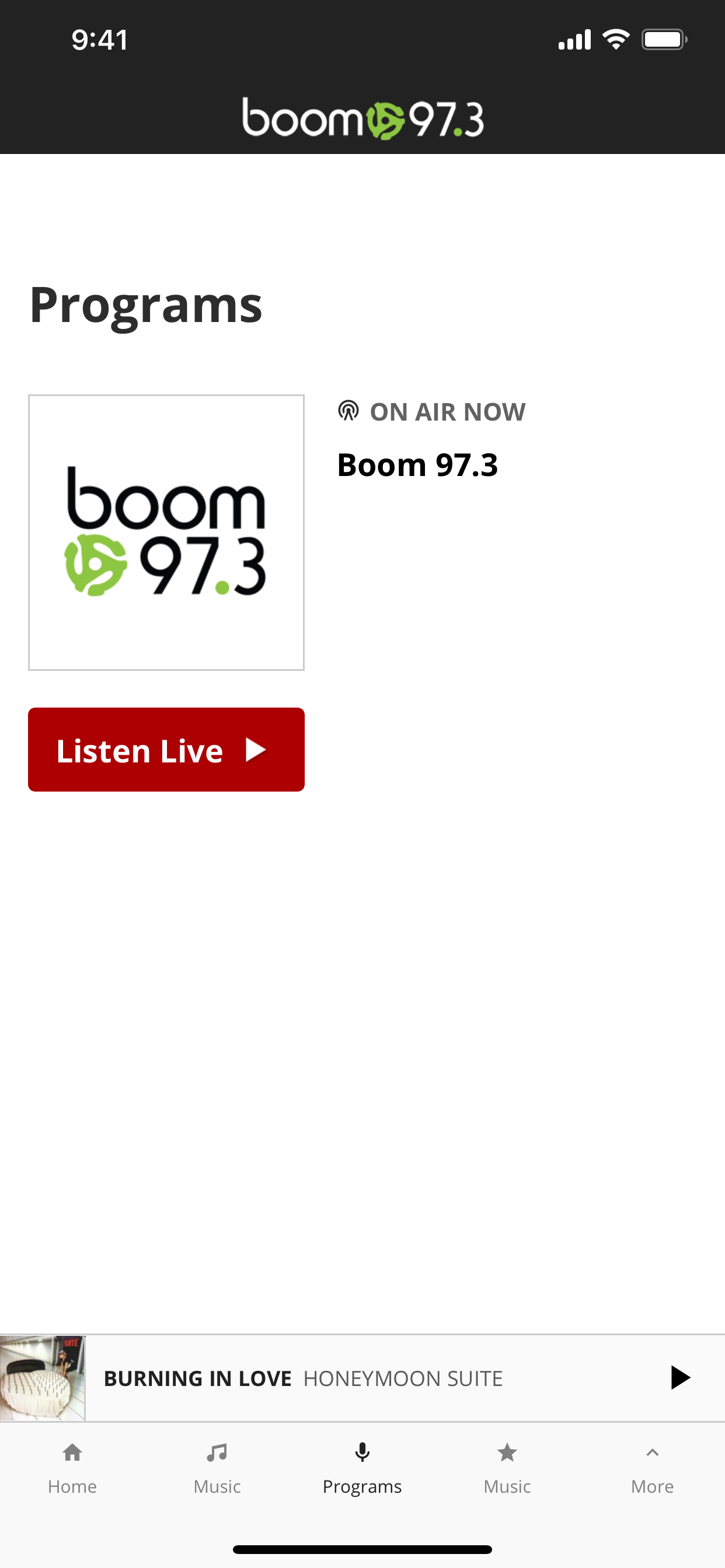
Need a magnifying glass!
I’ve been a Boom listener forever and loved this app until the new update 3 days ago! Why, why, why would someone use such a tiny font I’ll never understand. Can hardly see the words Boom 97.3 on the actual black background of the app logo and the tiny font of the menu items is ridiculous! Please fix! Being it’s an 80’s radio station, you must know that most of us listening are a tiny bit older so our eyes aren’t as good as they once were. Thank goodness our ears still work because I love this station. Thanks


