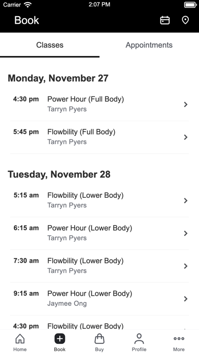
Disaster of an update
Poor visual hierarchy to texts, no pictures, little white space, poor user flow…most elements that were previously user friendly has been removed. Mostly importantly, adding booked class to calendar doesn’t work… what’s the point of a total revamp of the app? For some product designer making a presence?


