Limited functionality affects use
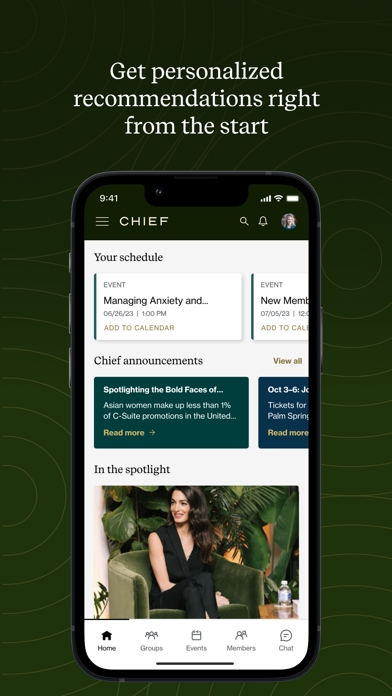
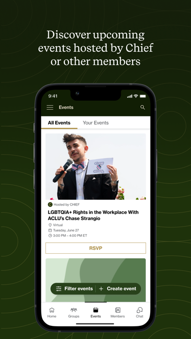
The app looks good and, to a point, works well. You can tell it’s not been designed or ux tested by actual Chief members though. For example all the events are totally jumbled and there is no filter button. Ie as a Chief UK member I’d like to be able to filter actual London events and virtual events to see what I might be interested in. Instead I have to trawl through loads of cocktail nights in SanFran which are of no use to me at all. The feed is the same - just random questions and comments with no ability to filter or search. So as a 101 version it’s ok but for the £amount a Chief membership costs - the app should be much better.


