

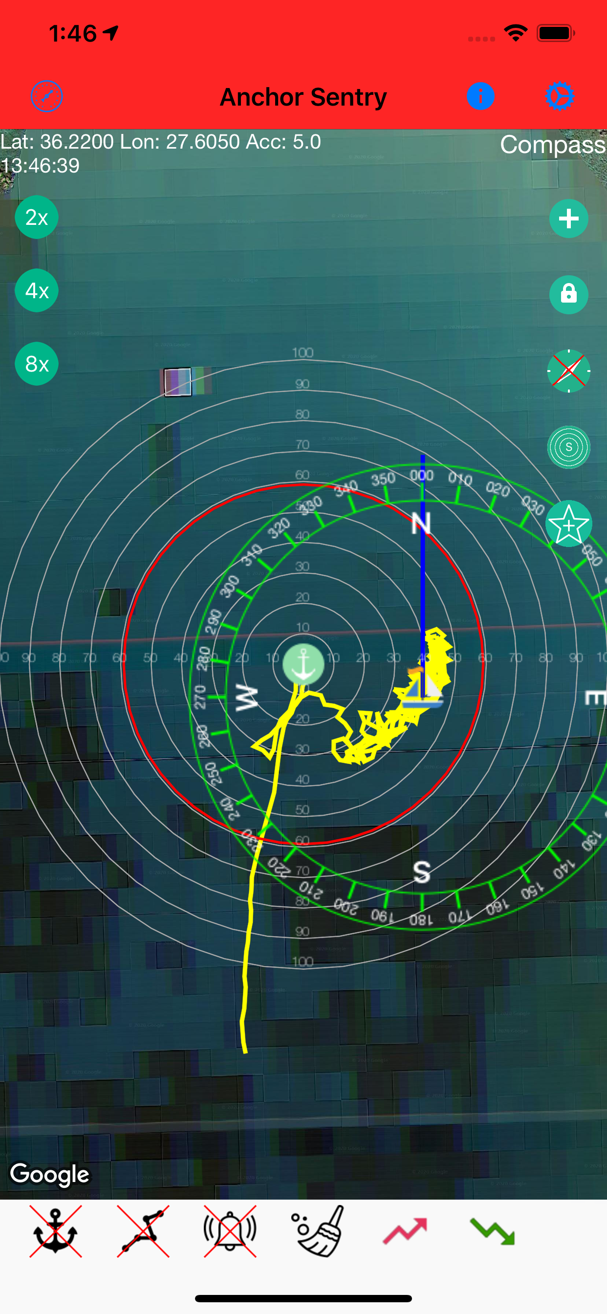
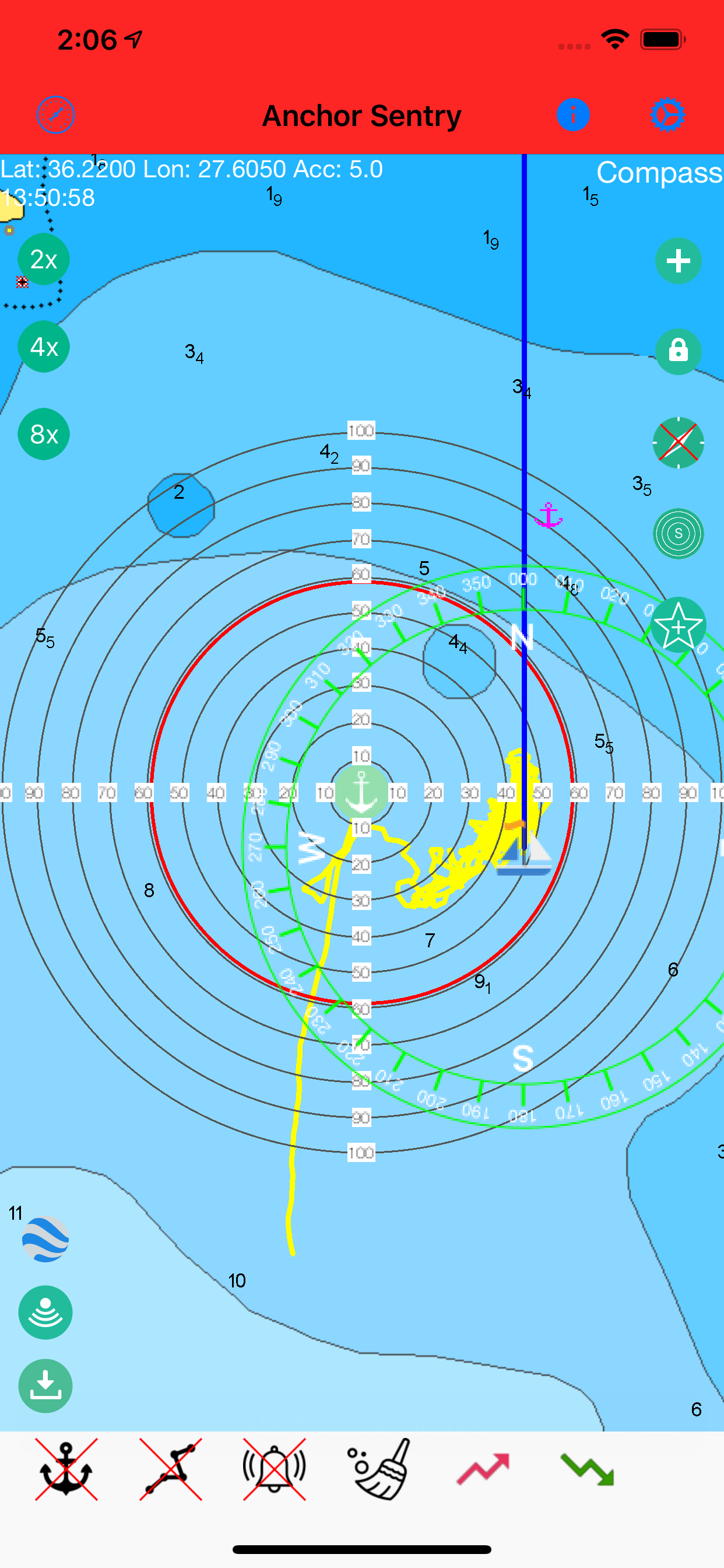


Bizarre design choices and fails to trigger alarm
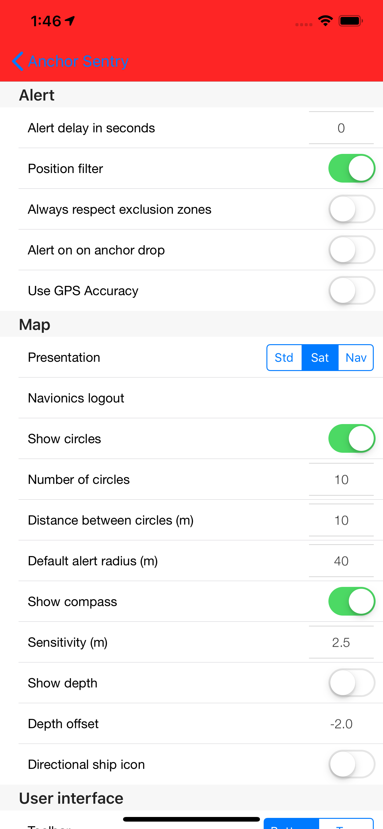
Why this developer has chosen to use a Red Cross, the universal symbol for off, or for bad, or for warning as the symbol for on is beyond me - you have to remember that the red X means something is on and not off and then you have to make your way through a bewildering array of badly placed and design icons to turn anything on. Given the plethora of anchor apps out there I would go for something else. I also tested it multiple times and it just wouldn’t trigger the alarm. Once or twice it was because I realised that the red X wasn’t but others it just wouldn’t fire. Time for me to find another solution