App design
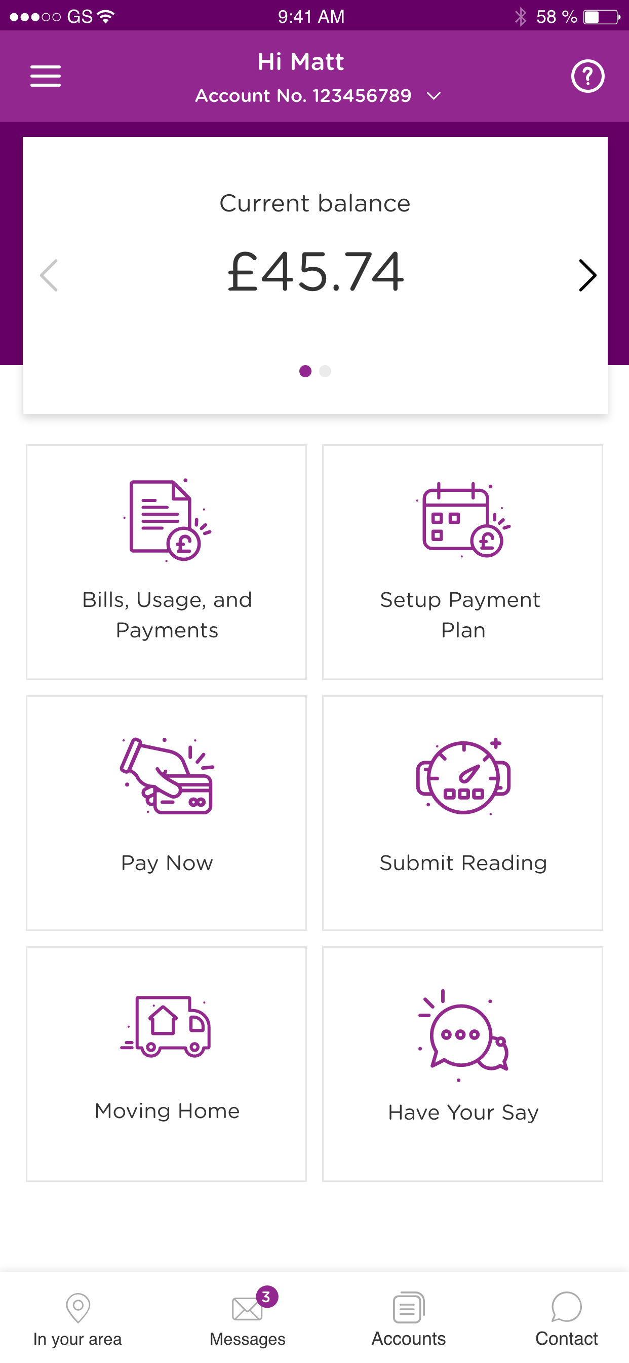
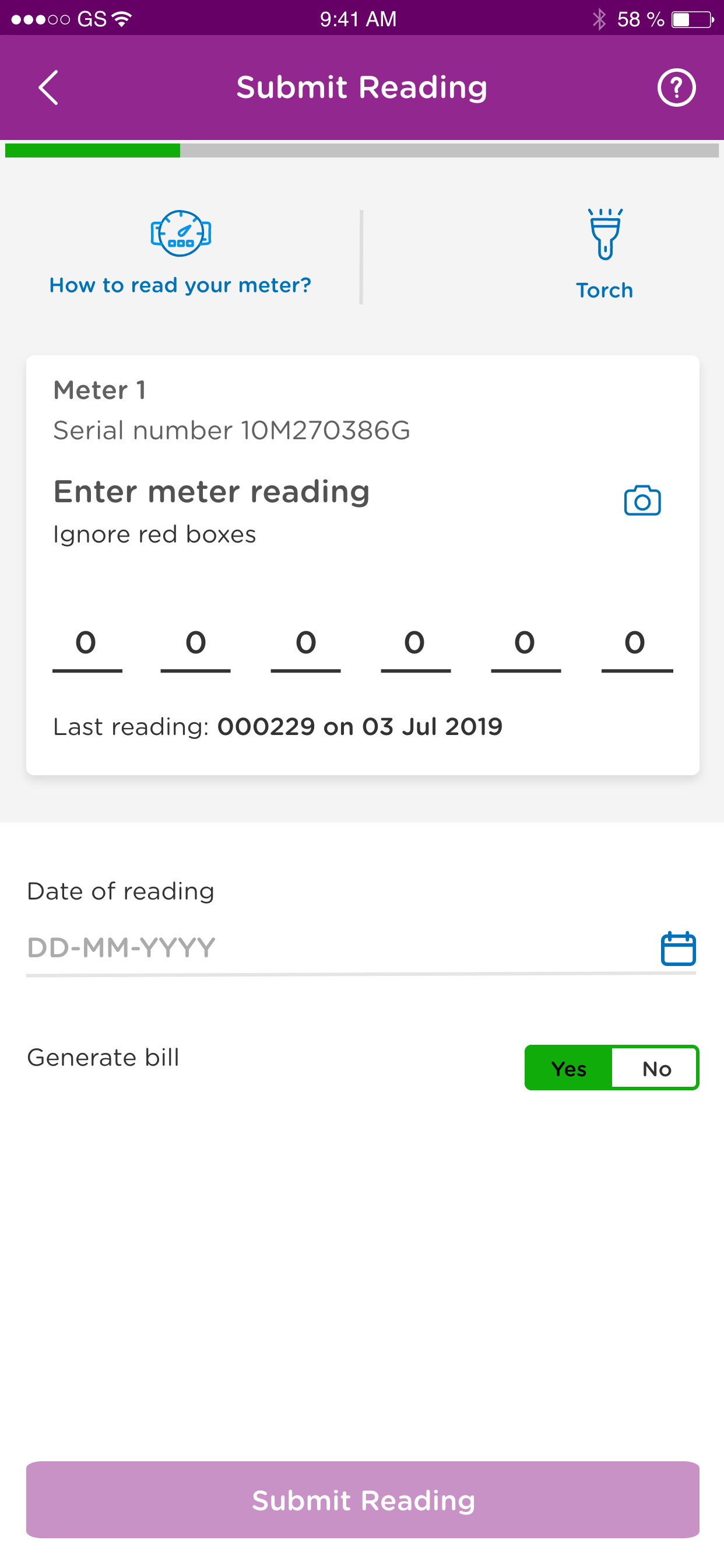
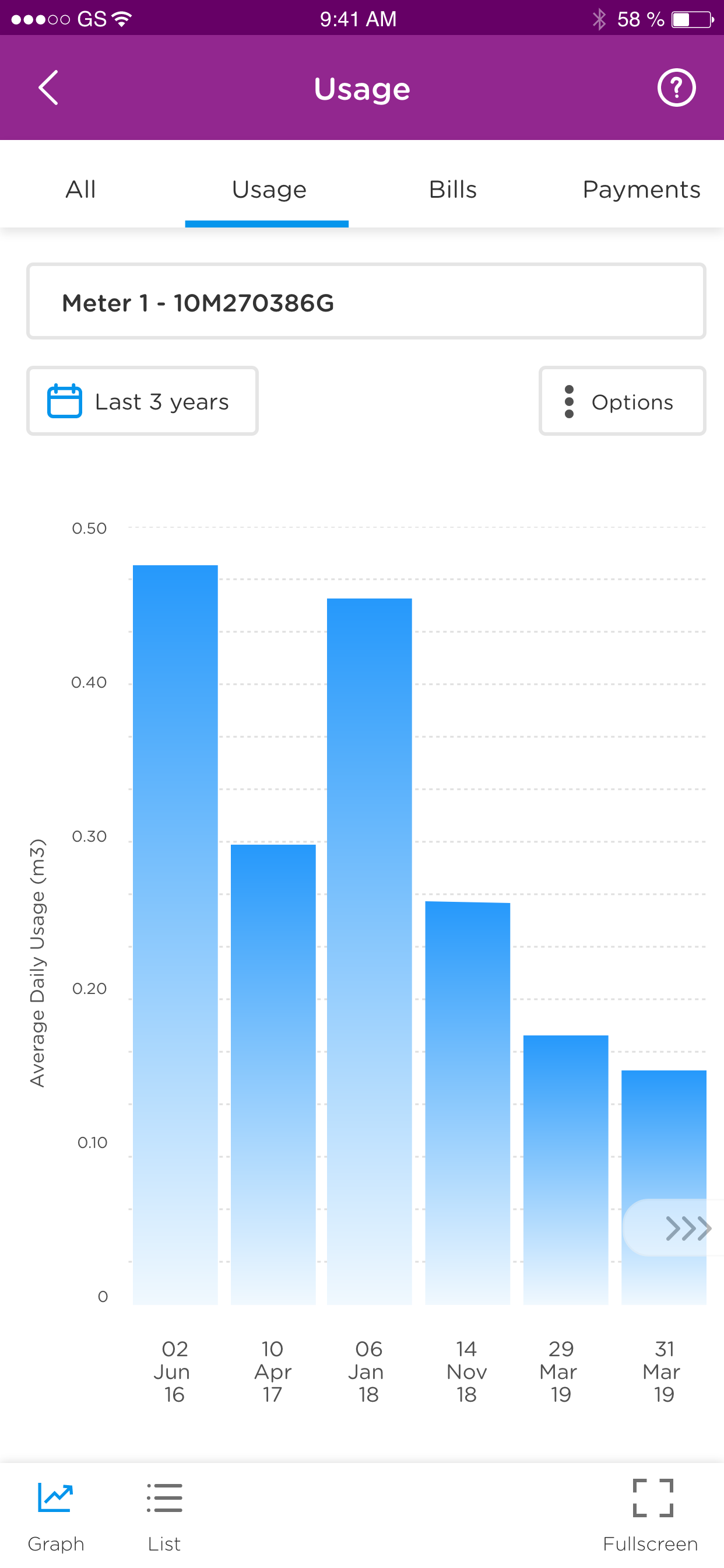
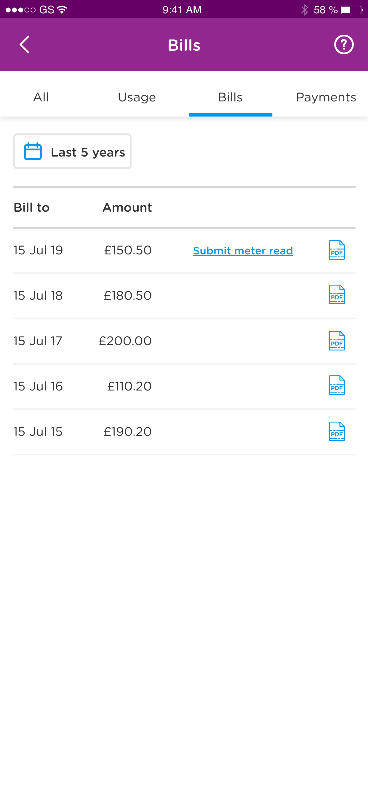
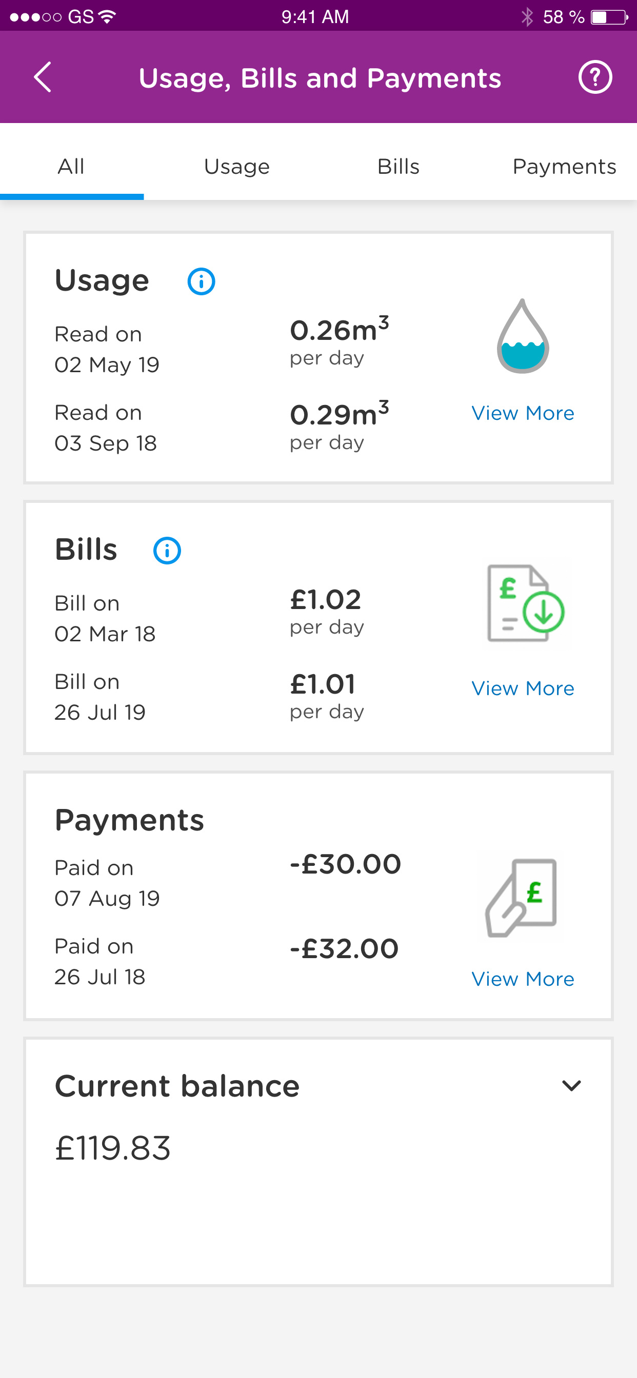
I find the app design very poor and clunky. Not easy to navigate and very difficult to read. The type font is very small and light blue font colour makes some sections impossible to read. For me the most important information is usage and cost of that usage but the usage stats are buried behind too many clicks and the costs either not there or impossible to find. All this makes the ‘smart’ meter a waste of time.


