Needs customization and streamlining: too much filler
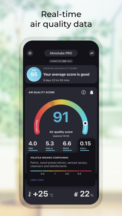
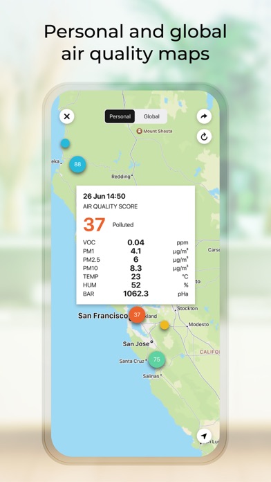
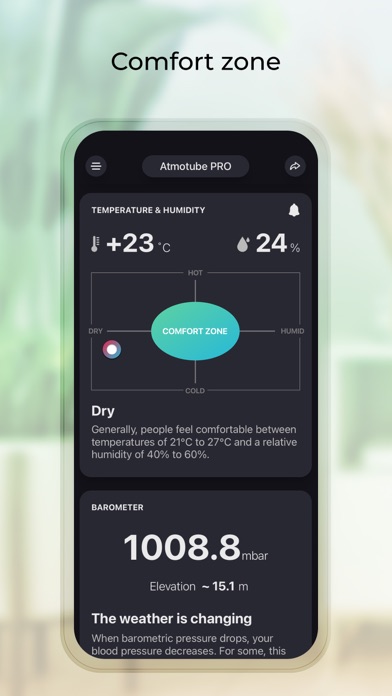
Needs customization options. Theres a lot of pointless text where I would prefer data, for example explaining that “people generally feel comfortable in temperatures between..”. I know when its hot or cold! Feels like its just filling space. I also would like to set when the map and average score reset: it is pointless to know what the air quality was on my commute months ago. The charts are decent, though again i would prefer customization, like to put PM on top versus on bottom. For something like this, people that buy a product like this likely know something about air pollution and it would be nice to put the data itself front and center rather than the dumbed-down things like the air quality score or comfort zone. Or at least to be able to configure it that way.

