Very rough around the edges
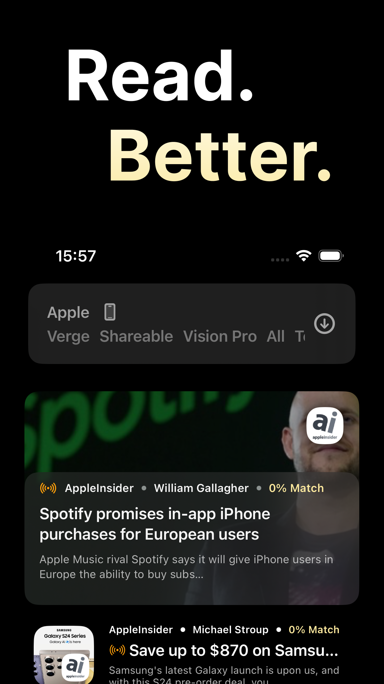
If I already provided an API key, why do I need to login? Or if I can login to my account, why do I need to provide an API key? These two things don’t make sense together. Seems like only one should be required. On the subject of logging in, that feature is very confusingly designed. Why is the form on Sign Up by default? No ones going to sign up for Omnivore through this app. This form should only support logging in. At the very least it should default to login. Once I’ve entered my credentials, there’s no login button. Instead there’s a blank gold color button at the bottom of the screen which I assume must be a login button. However, when tapped it does nothing. No error message or loading indicator. This problems makes the Discovery tab unusable. Back on the login form for a moment, it’s real confusing to see both the Remember Me and Save login Data options. Further, why is the phrase “Save login Data” capitalized like that? It looks like your shift key is broken. When I tap to view an article for the first time, I’m asked to login. Why? If this app can already see my articles using an API key, why do I need to login? Why is this login different than the login for the Discovery tab? None of this design makes sense. When I tap an article, it simply loads the Omnivore mobile website. Why would I use this app instead of the Omnivore website?


