Black on Black and White on White text
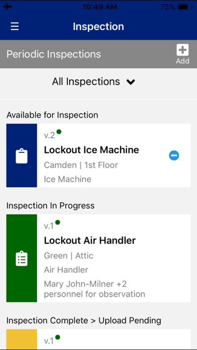
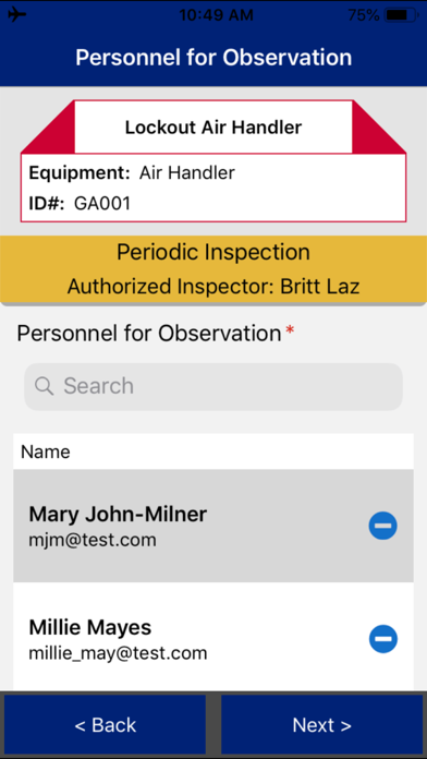
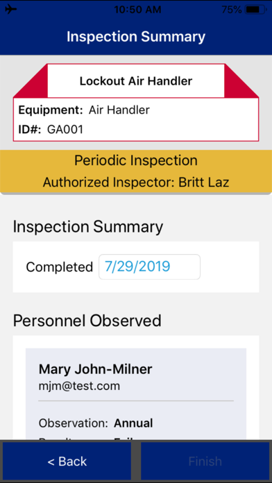
This app has some great potential for use, but why do the confirm statements for lockouts and inspection show up as black text on a black screen? It’s unreadable and confusing to the user. It did not used to be that way.

