At least the new version looks better than the old
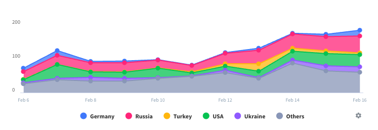
The old version was just a wrapper for the website. This version is a much less useful version of the website. Because the new rates have us keeping a sharp eye on the peak hours, seeing a usage graph was a good plus. Unfortunately, navigating the graph isn’t good and it doesn’t give any actual numbers. The bar could be low in context, but I won’t know if I have a new peak hour amount that will cause me to need to sell a kidney to pay the bill. Basically, you're better off just using the website. This app doesn’t even have the basic info you can get there and is full of bugs on top of that.


