Issues with UI
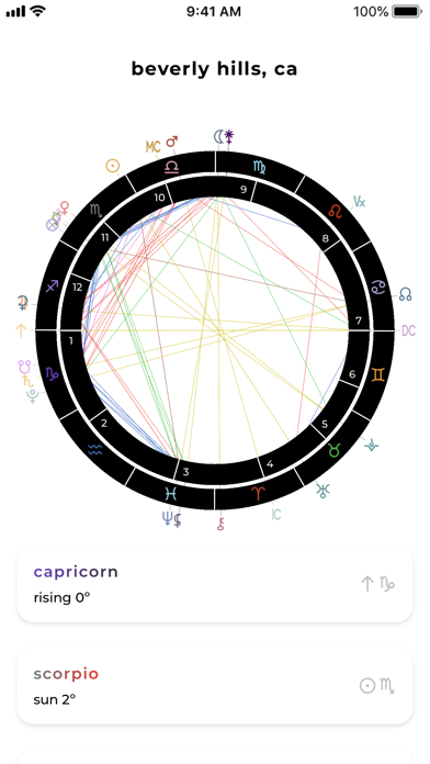
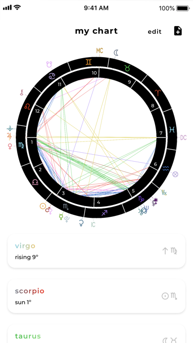
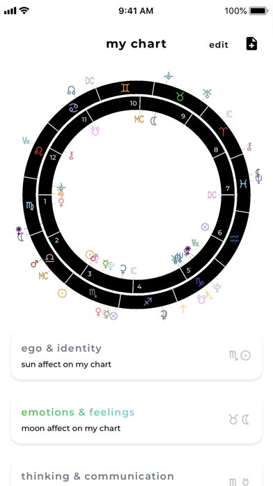
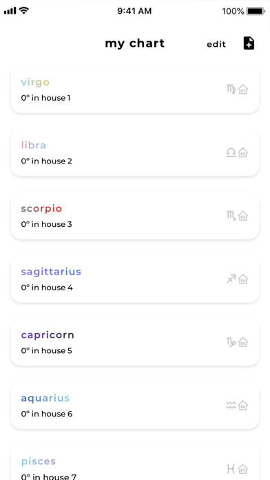
I’ve been using charts for years now at this point, and it’s always been my go to. However now when I open it the outer circle covers up the signs and planets on the chart. I’m only able to know where things are at by looking below in the data sections. I still use it but would really like an update to fix the UI issues.

