Great idea, needs work
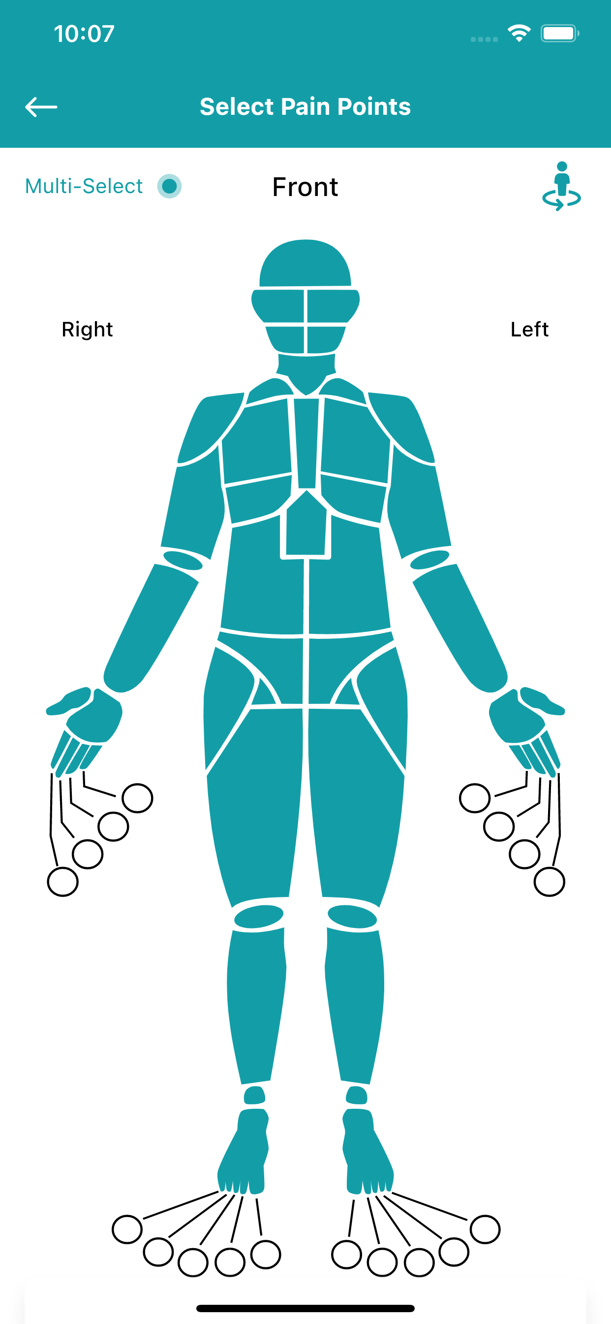
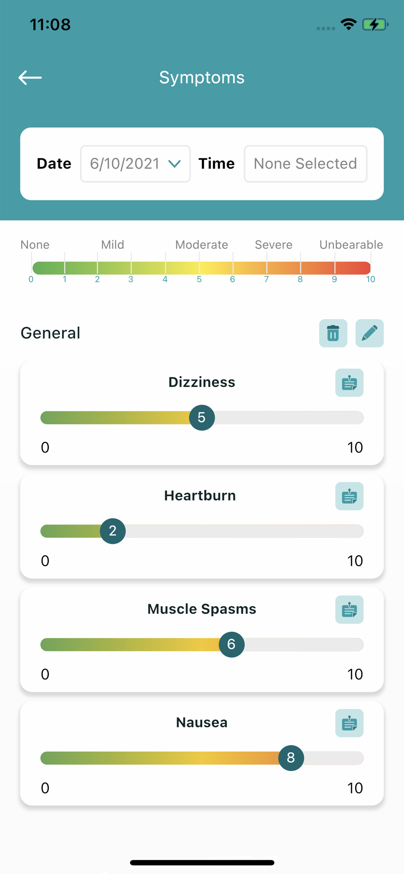
I was excited to try this as I have several chronic health conditions and it could certainly be helpful to keep info abt this in one place, especially symptoms tracking and medications. But last night when I woke up with symptoms I wanted to enter, it was a cumbersome mess that resulted in me giving up after 10 minutes of frustration with the app. It should be simple to click which symptoms you are having and timestamp them. Instead I was overwhelmed with a huge list of symptoms that had nothing to do with my issue and I wasn’t able to get that category to go away. When I finally thought I had added a symptom, it was just blank with a timestamp. I feel like this has all the bells and whistles, which don’t get me wrong, are great ideas, but if the basic concept doesn’t work smoothly then adding all the other things is just overwhelming and confusing. And I’m quite good with technology…I can’t imagine how people that are not would be able to use this.


