Bad uninformative UI
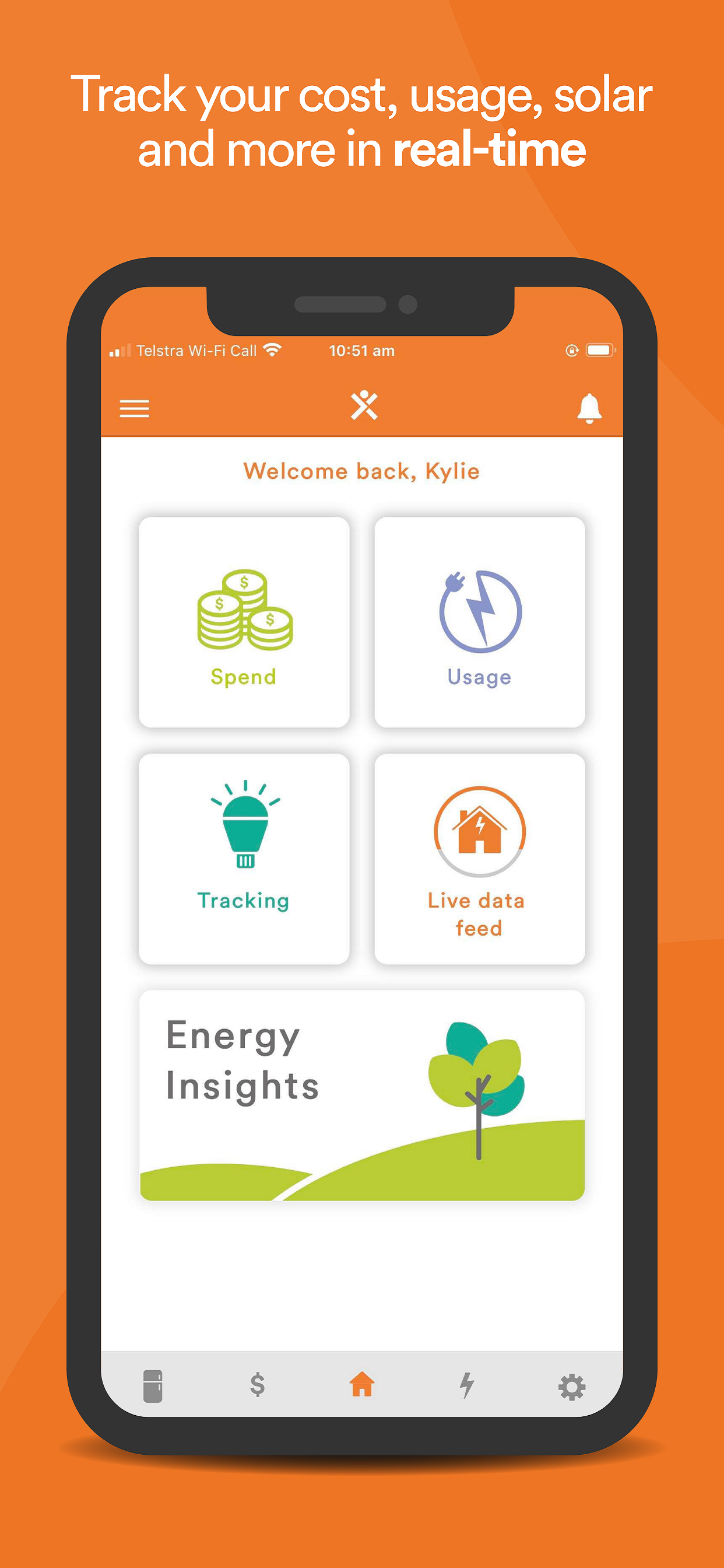
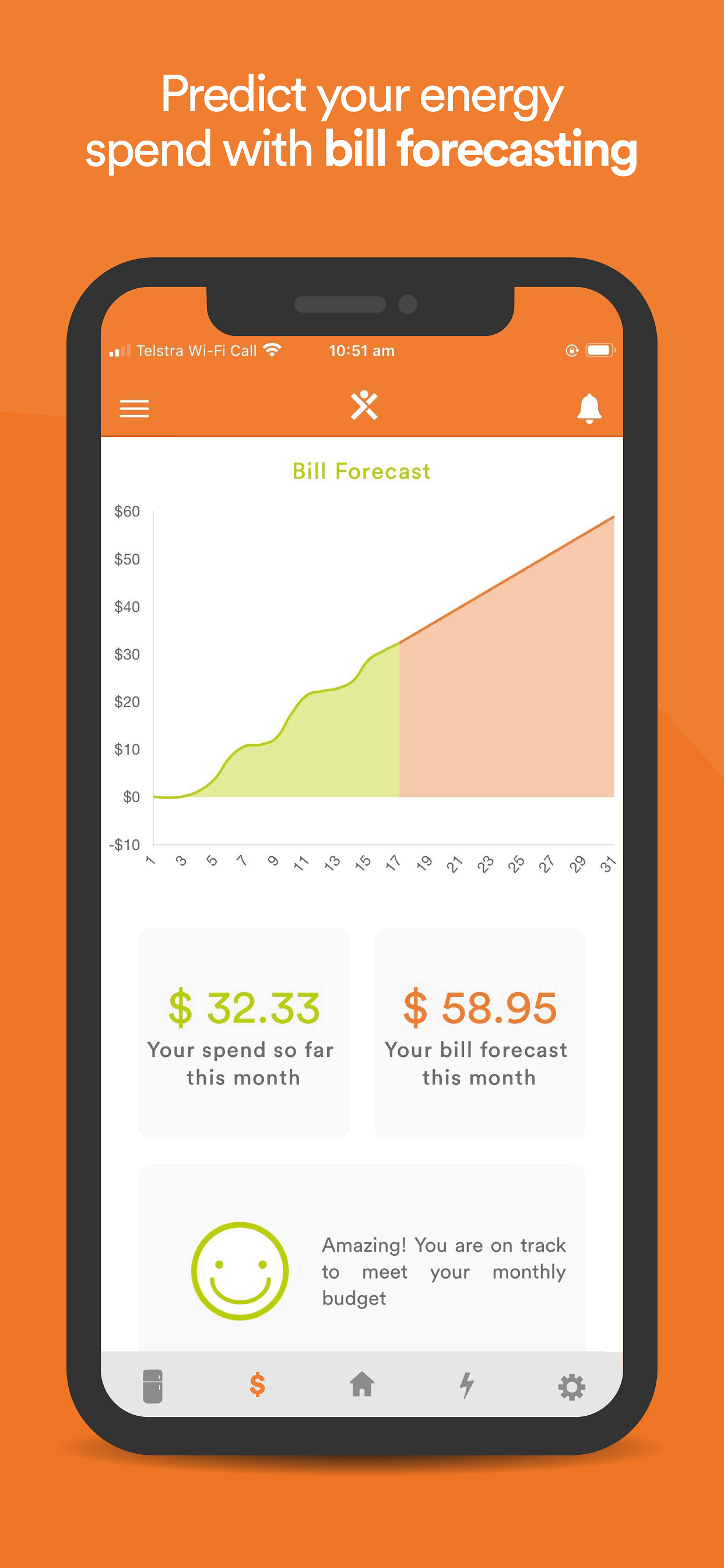
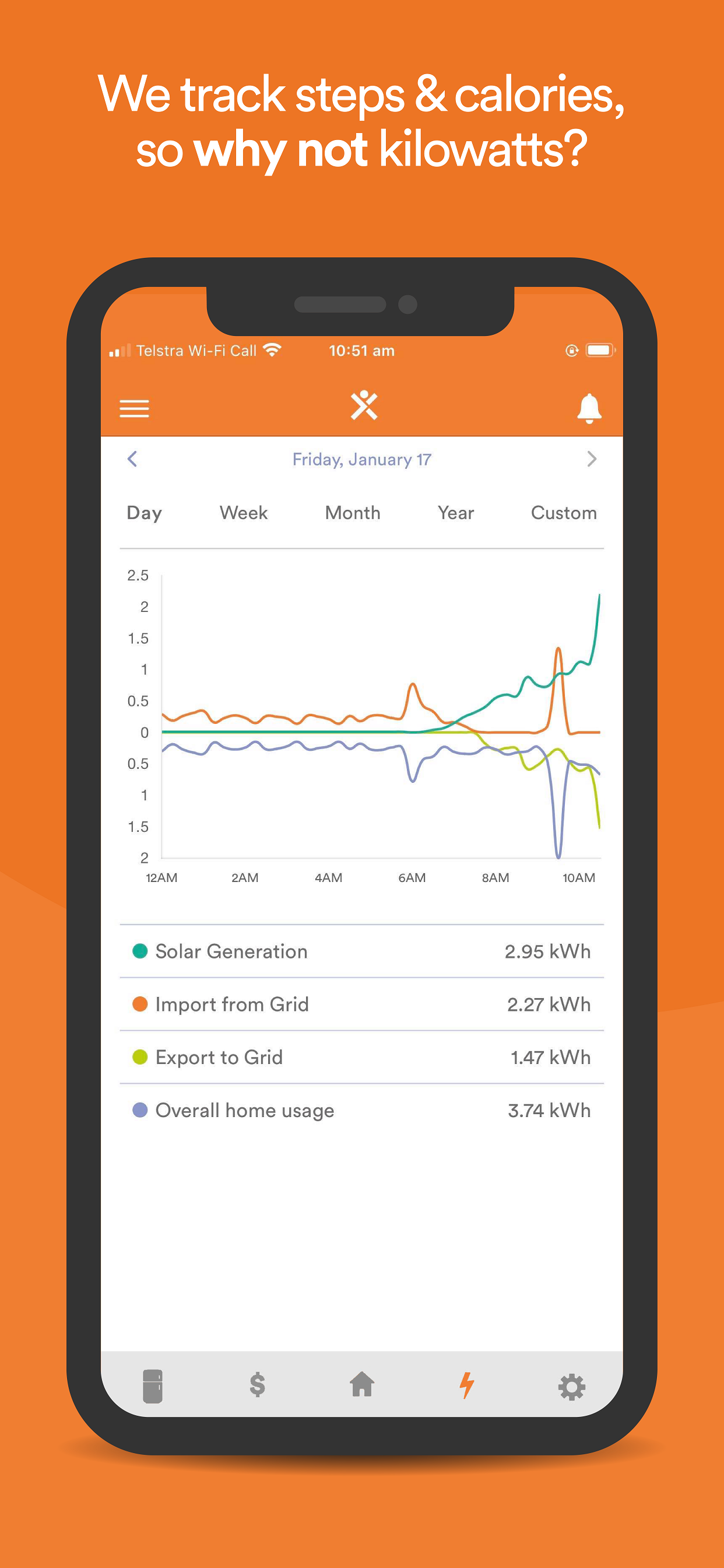
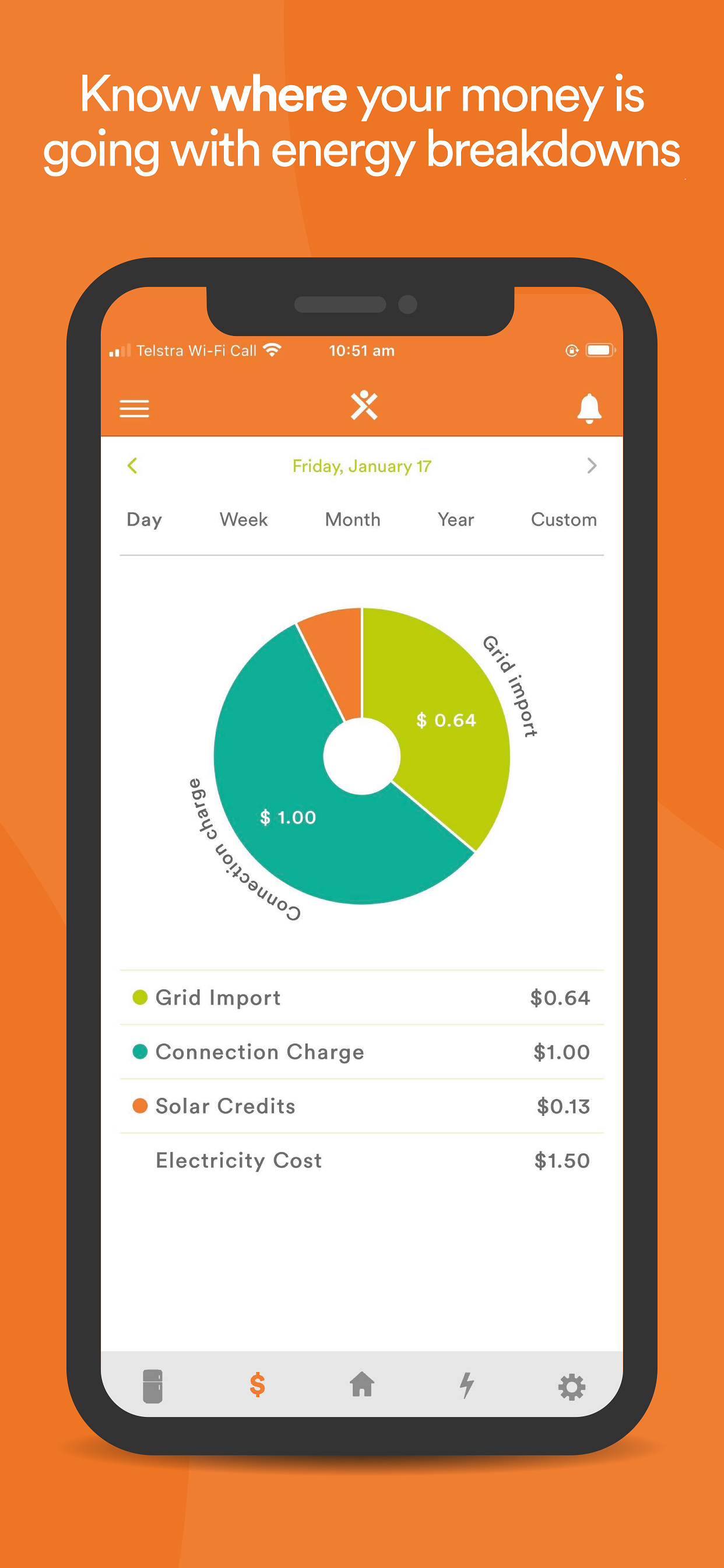
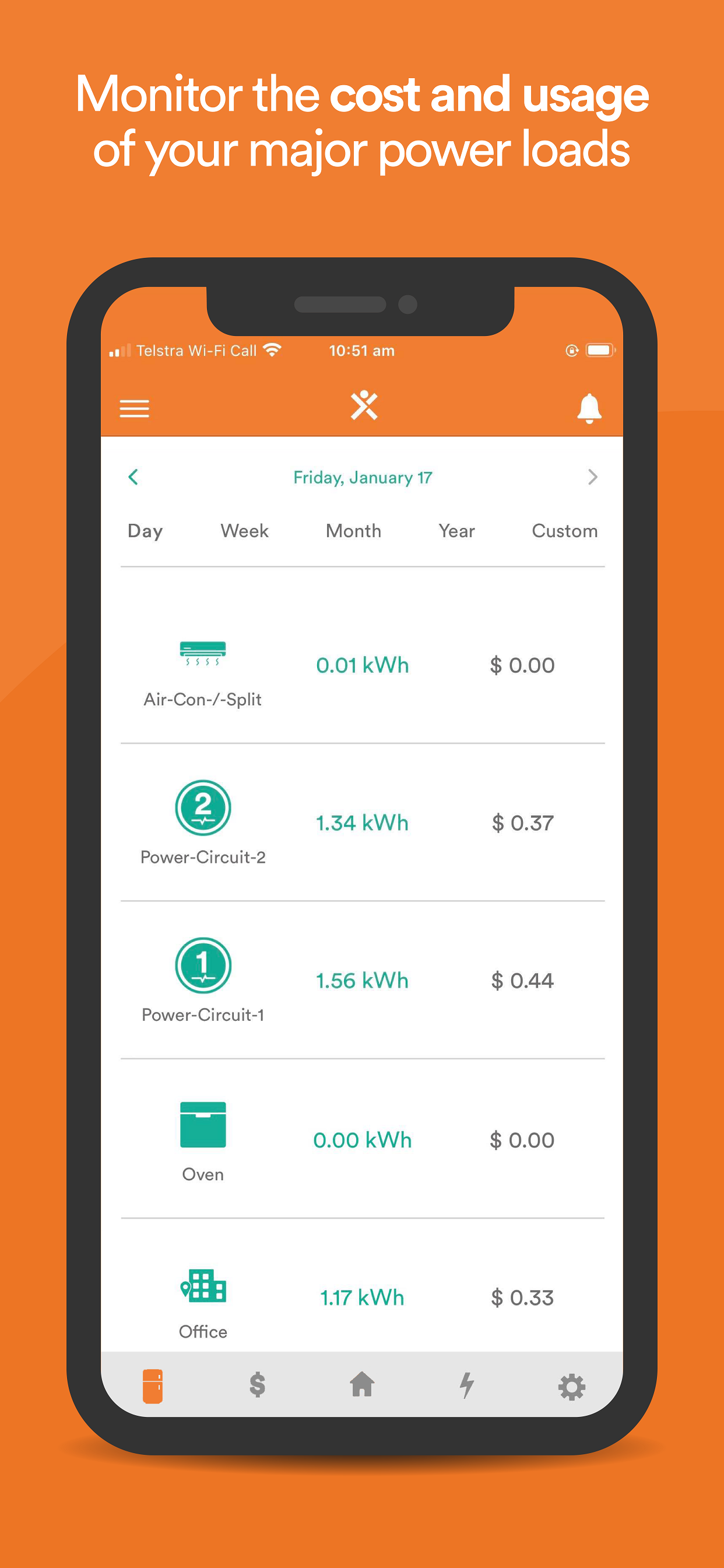
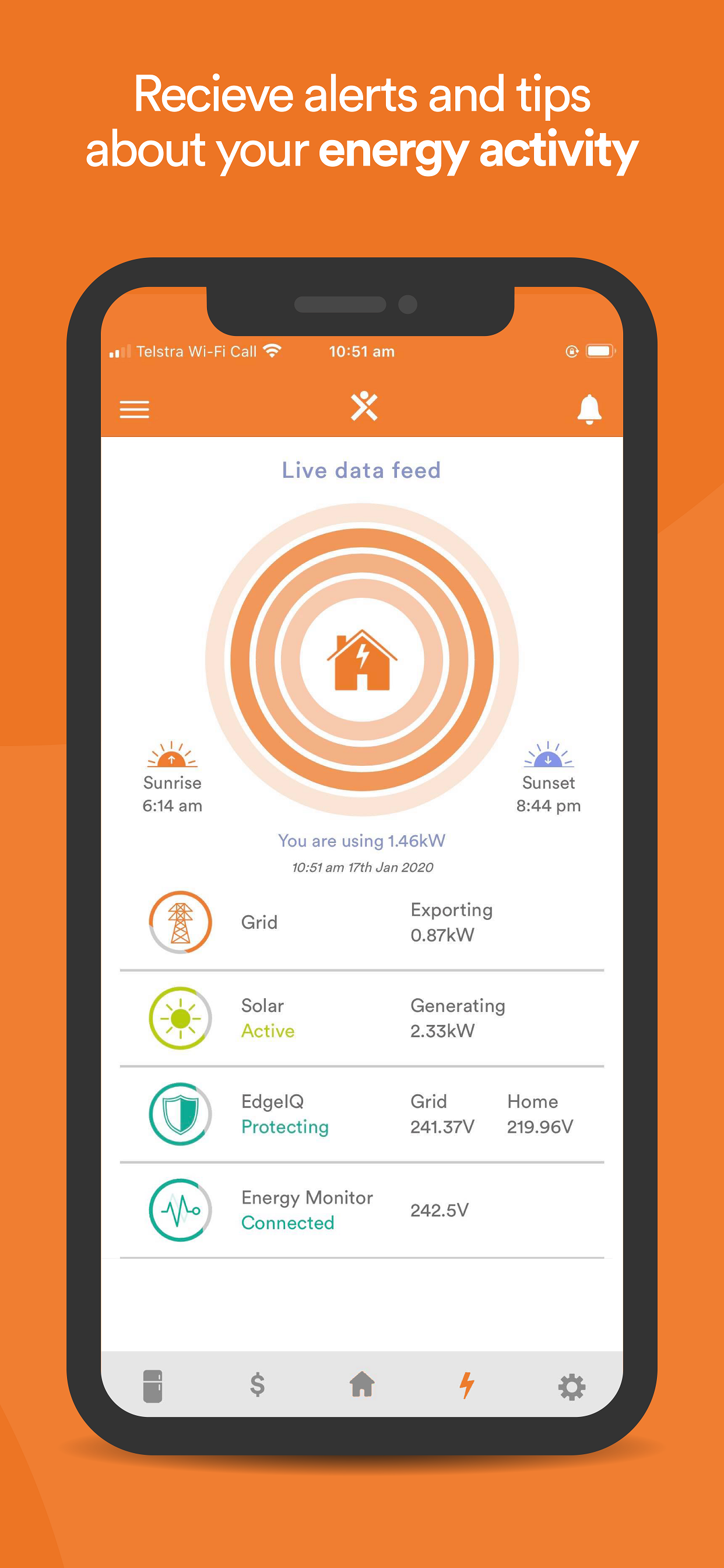
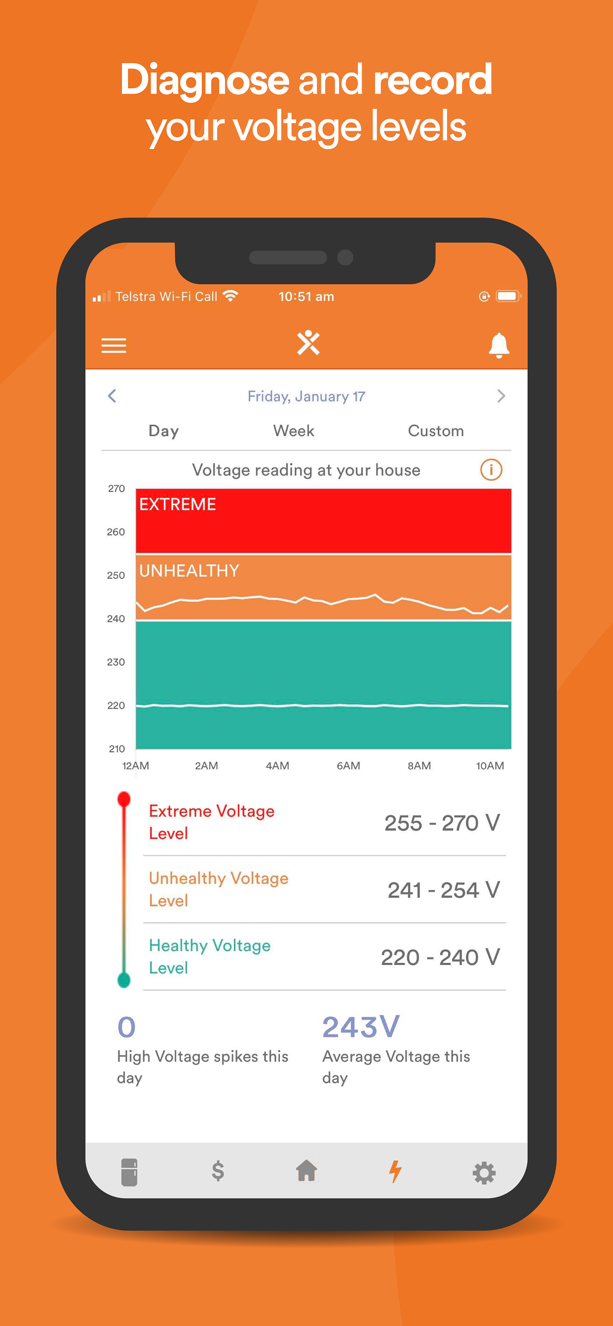
I want to love this as I paid $400 for the device but the UI is really poor. It need a re write from the start. There is a lot of useless information or buttons that go really no where. It’s hard to remember where that bit of information was - there isn’t much to see so that’s saying a lot. Should look at apps like Tapo which has a nice energy monitor for their plugs. Or even tuya smart which is basic but is clearer. I actually use the installer app to get a better idea of what kw each circuit is actively using.

