Self aggrandising and painful to use
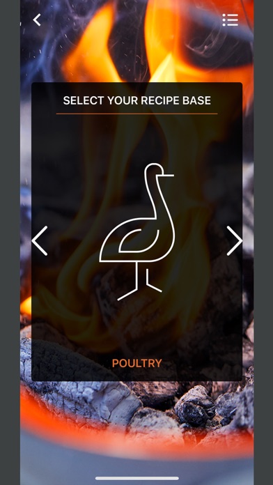
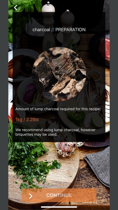
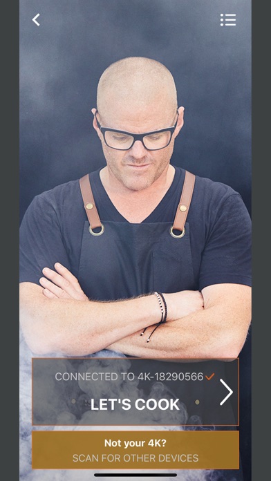
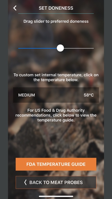
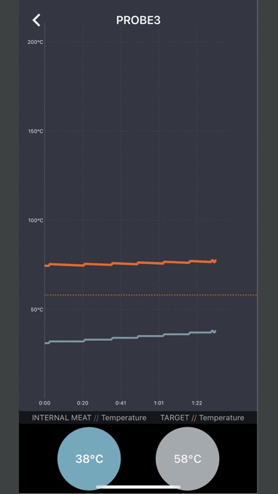
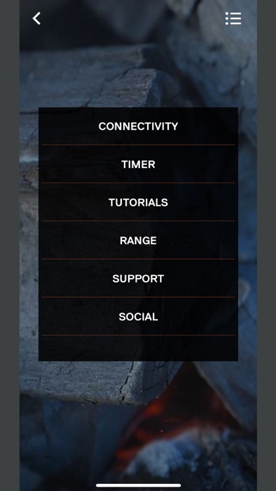
Second time I used the app it was clear it was designed to promote the brand rather than support the process of cooking. On opening the app all probes and a pair button should be present on the first screen. They are not. Instead these most important features are layers deep on separate screens with probes not even easily accessible unless a target temperature is set. Having attempted to use the app now many many times I am sick of the unnecessary splash screen, sick of the many swipes and taps to get to any feature and sick of the need to repeat the multi swipe, multi tap process of reconnecting any time the app loses connection (which is often). Developers. I rarely want a guided cook. With the exception of charcoal, I am never likely to shop through the app and will definitely not use it to evaluate a new Everdure barbecue. I am also uninterested in a big screen with two ‘social’ buttons. News Feed is potentially useful (contains recipes, not news ¯\_(ツ)_/¯) , but it seems abandoned with only four items and a title that compelled me to avoid it until today. Please just provide a simple option to set a target temperature from the first screen and to receive notifications when any probes reaches that target.


