Sweet
A sweet UI Kit, wish they would support Flutter as well


Yes, Grial UIKit is completely free and it doesn't have any in-app purchases or subscriptions.
Not enough reviews to make a reliable assessment. The app needs more user feedback.
Grial UIKit is free.
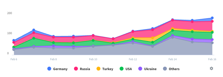
To get estimated revenue of Grial UIKit app and other AppStore insights you can sign up to AppTail Mobile Analytics Platform.

5 out of 5
1 ratings in Canada
A sweet UI Kit, wish they would support Flutter as well
I really love this app.
I love this kit! Super cool layouts and controls for building apps real fast for Xamarin.Forms :)
I’m sure this is a great control library, but this app is described in the App Store as a tool for creating forms on a mobile device. They should state that in the title or description instead of wasting people’s time. The one star rating is based on the app not being what is described. I can’t speak to the quality of the library itself.
You can safely ignore the 1 star rating from a person who had no idea this is a DEMO and not a useful product. Just browse the author’s website if you are unsure. There are few competitors to this kit (as of Feb 2019).
I still don’t know how to use this app. It [app] claims that you can Use this to make your own app but I don’t even know what’s Going on 10p% of the time
Have published first app using Grial UIKit to the AppStore and it was a pleasure. It literally took 90% of the UI work out of my timeline (and probably ended up looking much better than I could ever have come up with). Took a several month project and helped me get done in about 3 weeks. Great support online, and the kit was updated even while I was in development with new features and platform support. Looking forward to future updates as well. Recommended.