I don’t like it
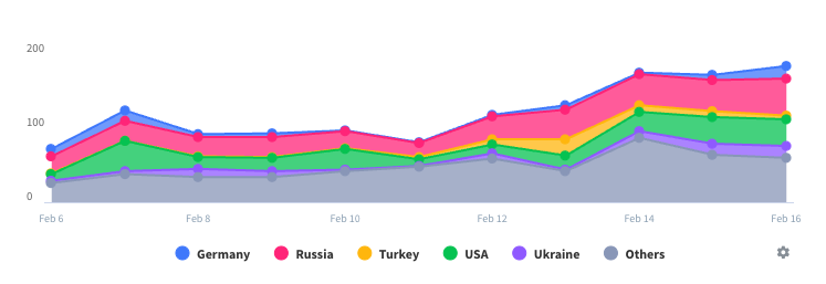
It is an overall good app, it has a really nice design and is easy to use, but there are plenty of things that I don’t understand. First of all, why in GLOBAL we have countries and US states? I don’t get it, I want to see the infected people globally not a fragment of each country, that information should be added when you tap the USA. Second of all, why can’t you add graphics? almost every other page has graphic that let us see in which position of the curve each country is.


