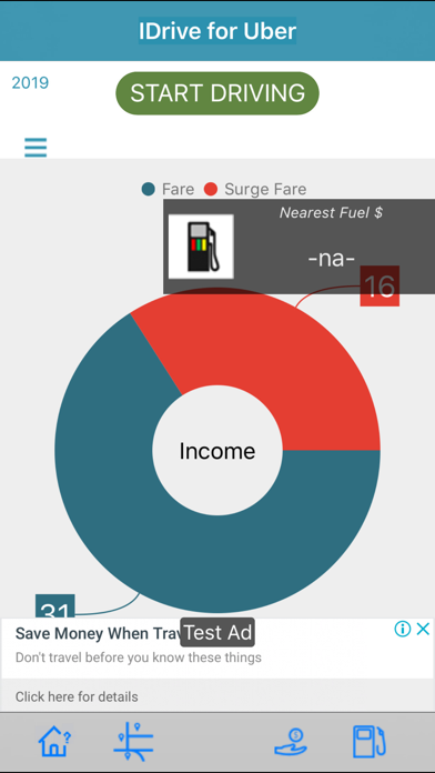
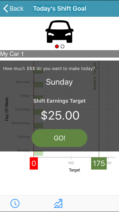
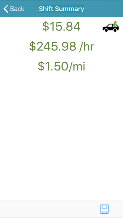
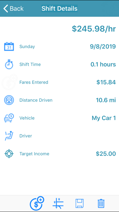
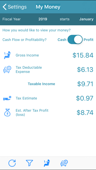
White text font white background … is absolutely not intuitive or user friendly
Why someone would create an app designed for entering info then make the font white on a white background is beyond stupid, not only can I not see what I’m typing it won’t matter anyway because it can’t be read. I saw one time where I could enter my vehicles miles at purchase but I didn’t do it and now I guess that is no longer an option so tracking total miles since purchase is off the table. Finding things in this app is beyond frustrating. And watching the how too only makes it more frustrating. It seems like it could be good if more time was spent in development and testing me as for the others they see mere carbon copies with different names idk why there’s a need for any of the others just name this one for all of ‘‘em and be done with it

