Waste of time
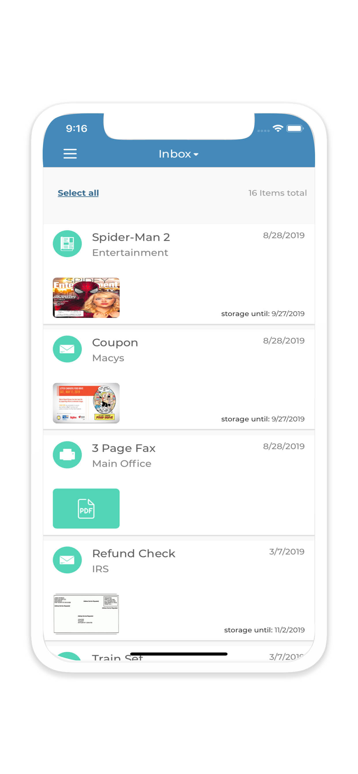
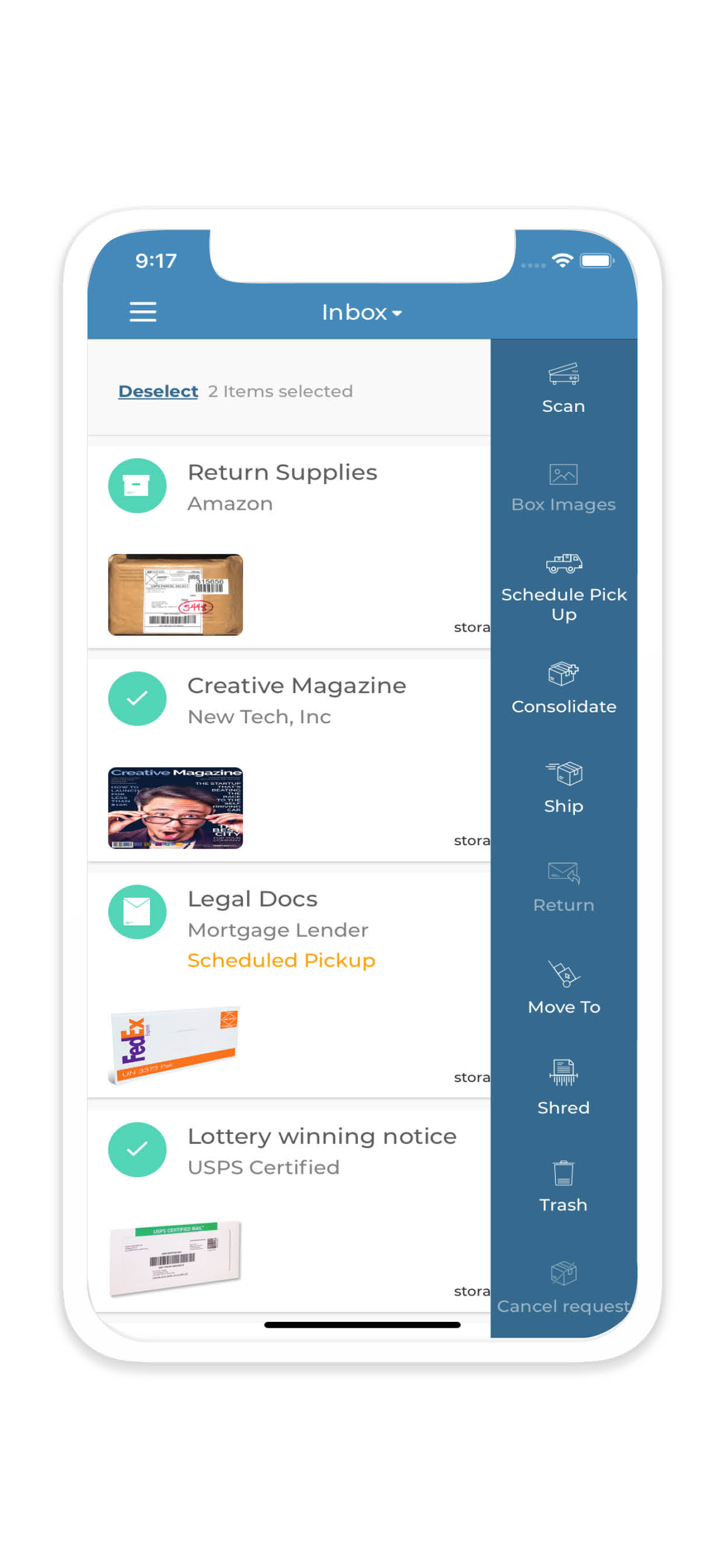
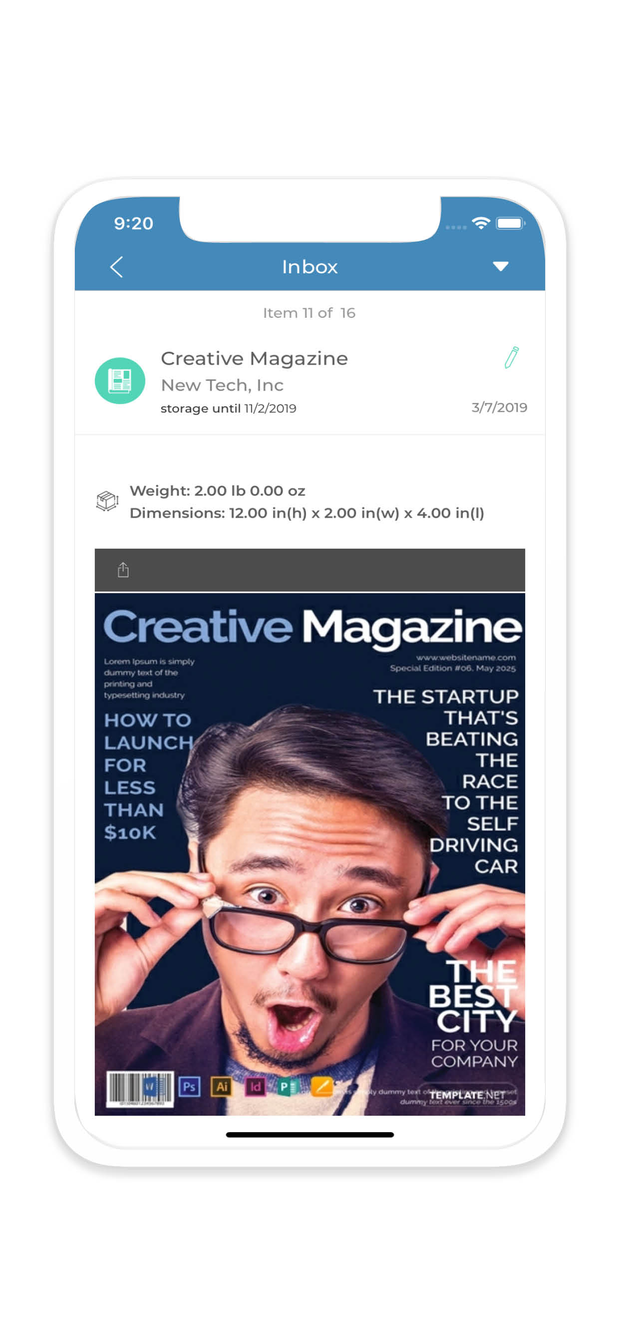
I really wish I could rate this one better since this is how I am currently getting my biz’s mail. It’s as if the app was designed for a high school project and never really updated after. -Many things available on the web are not available on the app. - App over-fills the screen (phone or tablet) as if it was sized for a much larger screen. -Several tasks or user-selected actions cannot be used because they’re sized beyond the screen’s edges when you select them. Just overall a clunky, 4 year old interface that needs major updates just to catch up and become a useful tool. Sorry guys, this one just isn’t good. 🤷


