Could be a great App
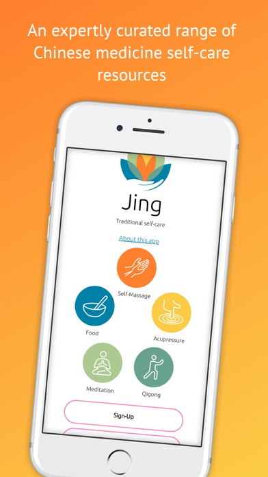
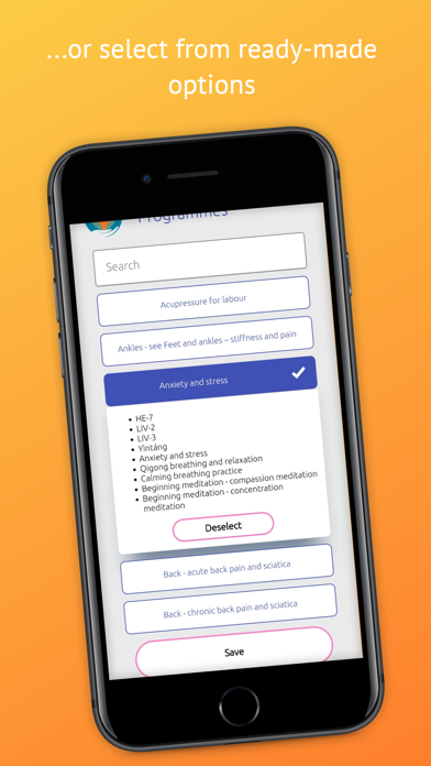
This app has great potential but it needs a lot of work. For iPhones there is no header, just a blank drop down menu in the content sections when you’re adding new content for a patient, this means you have to open each section to find what you are looking for. Feedback from patients has been that they love the video exercises but would like an indicator as to when the video ends. Some of them have been standing there, thinking the video is going to continue when it’s just stopped on a frame. An app like this needs routine updating, not every 8 months. It seems like they wanted to make something good but also just wanted it to create passive income without much additional work and that is not a good look for the future of an app. It tells me they are not interested in regular improvements and the longevity of the app. I hope they invest more time and effort for the future of this app.


