Get an app with a Better GUI navigation
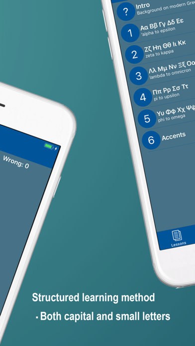
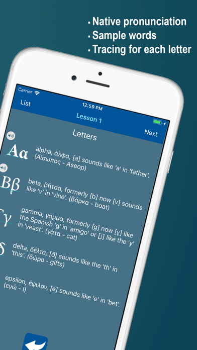
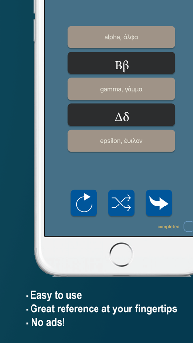
The app gets the job done, but the UI navigation design isn’t good. For example, Each letter requires 2 clicks to get there (you have to go through a main list first. The letters would be better in a 1-click grid. Worse, the pronunciation card is hidden. When you are looking at a letter, you have to know to tap the white arrow (?) to get to the pronunciation. Maybe have an icon of a speaker so that I know what it means? Plus, why 2 more taps? There should be a tappable button or word (or a speaker icon) right on the letter to get to that letter’s pronunciation. Worst of all, come on! Beginners need pronunciation *Repetition*. Lots of repetition. But, no… If you want to hear the pronunciation of a letter Repeated, there’s no “replay” button (?!). You have to go all the way back through the menu *3* taps to get Each repetition. That’s just bad, bad design, dev. Please upgrade the UI to a more easily accessible interface. Thank you!

