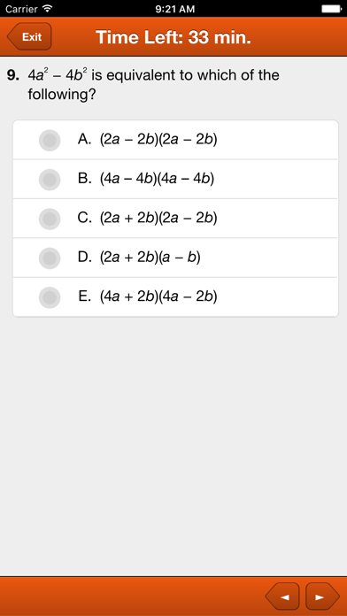
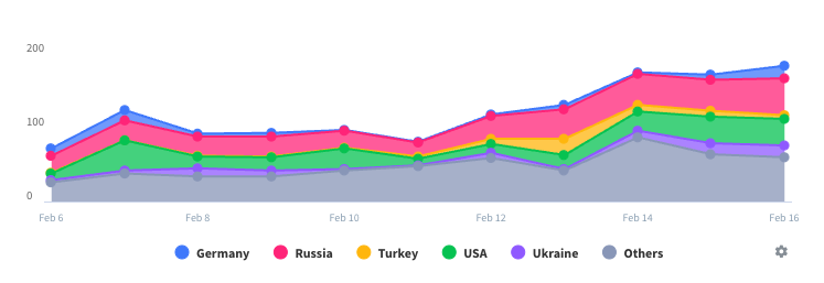
Data Interpretation too small
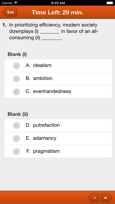
Overall, this app is okay, but my one major complaint is that the quality of the graphics for the data interpretation is too low. Pretty much every time I know I'll get at least 3 questions wrong just because I can't see the information displayed properly. It's always frustrating, because I generally can read graphs just fine. It would be MUCH better if there were a way to zoom in on/enlarge the images.


