This used to be decent…now it’s awful
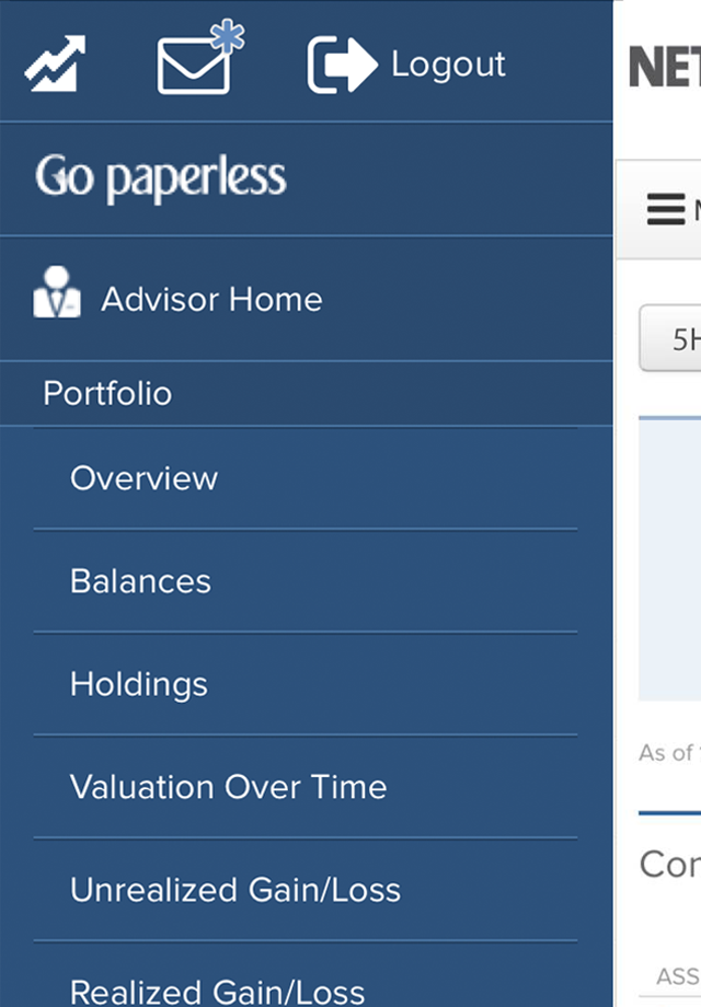
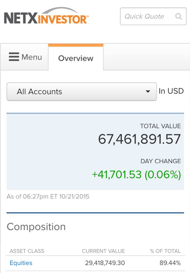
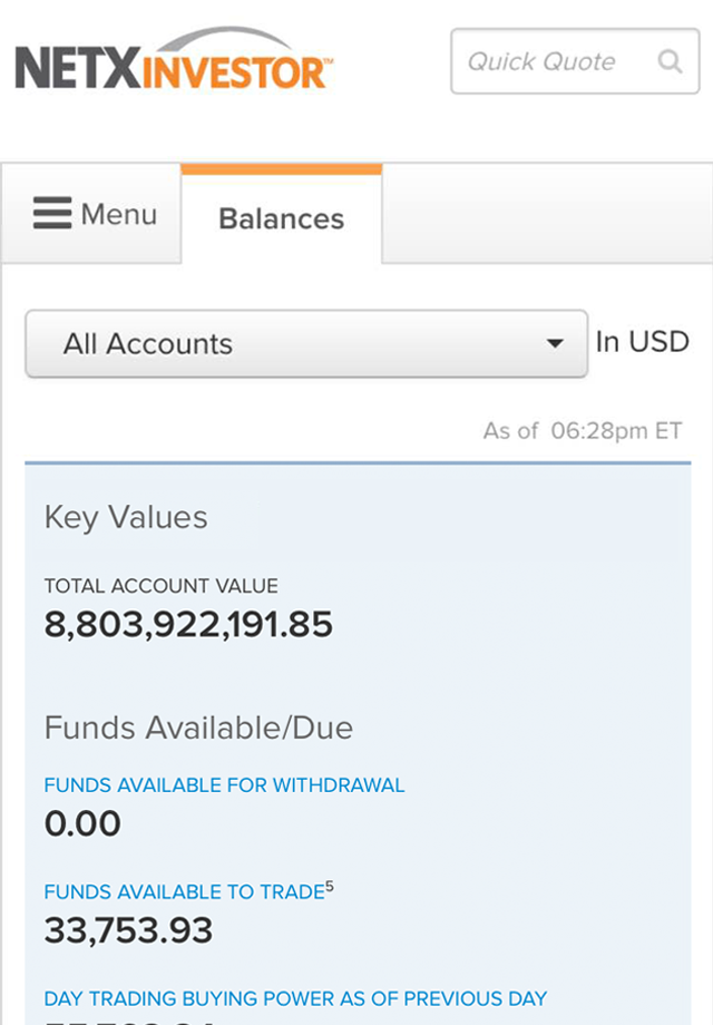
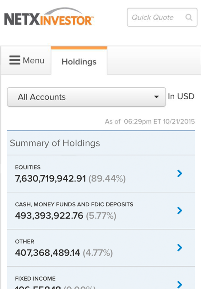
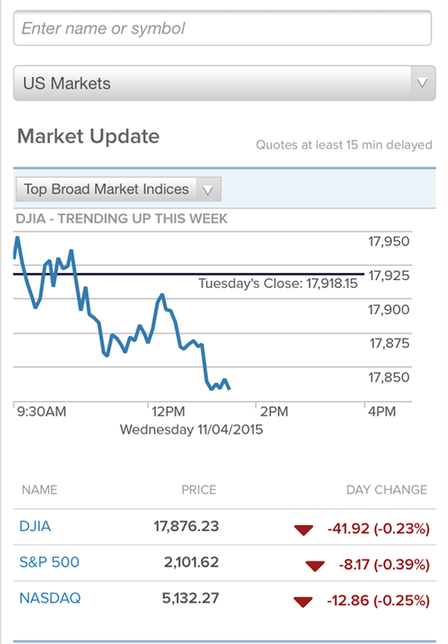
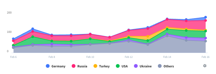
The new design is totally worthless. Want to know how many shares you own? Can’t find it. Unless it’s the start of the month, the chart on the front is out of date…up to a month. Want to know how much your portfolio changed today? It’ll scroll by before you know it. Want to read the light gray font on the white background? You can’t. Please go back to the old version and start again.

