Huh?
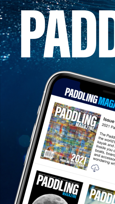
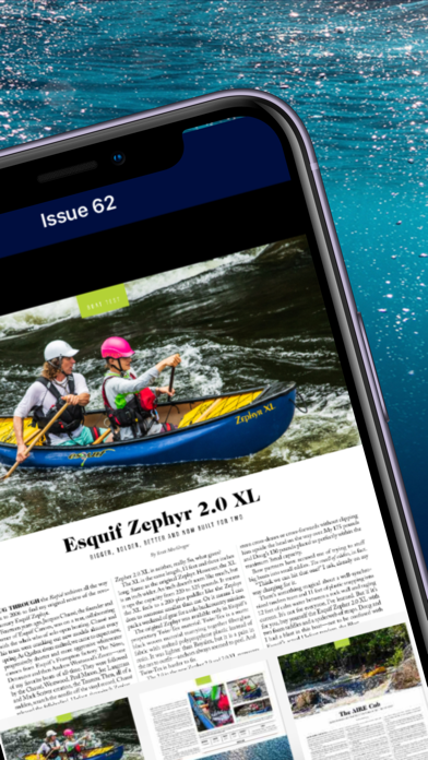
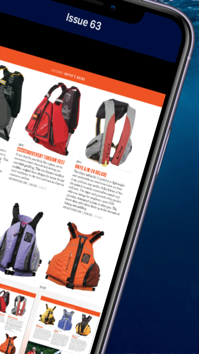
On my I-pad there are non-existent links or links that don’t do anything. I click on the current issue magazine cover from a page with multiple issues shown and all that happens is that I get a single-page view of nothing but the cover - no navigational buttons or links. I click on buyer’s guide and a very similar thing happens. I do get some filtering but that appears (on an I-pad) to be broken also. I may be doing something wrong - but a well-written app should be designed so that it is easier to do the correct thing versus the wrong thing. It amazes me that if designs that I create on my job worked as well as some of these terribly designed web-sites I would no longer have a job. This is your job/profession - get it close to right. Have some folks who aren’t part of the design/development team test the product before you release it (on all common device types) and then users wouldn’t be the first to encounter usability issues. I LOVE the print edition and the quality of that rates 5/5 or 10/10 but I am surely disappointed in the on-line product that I was really looking forward to using until the first issue of my resubscription comes. I have been a subscriber since 2018.

