


Great app but room for improvement
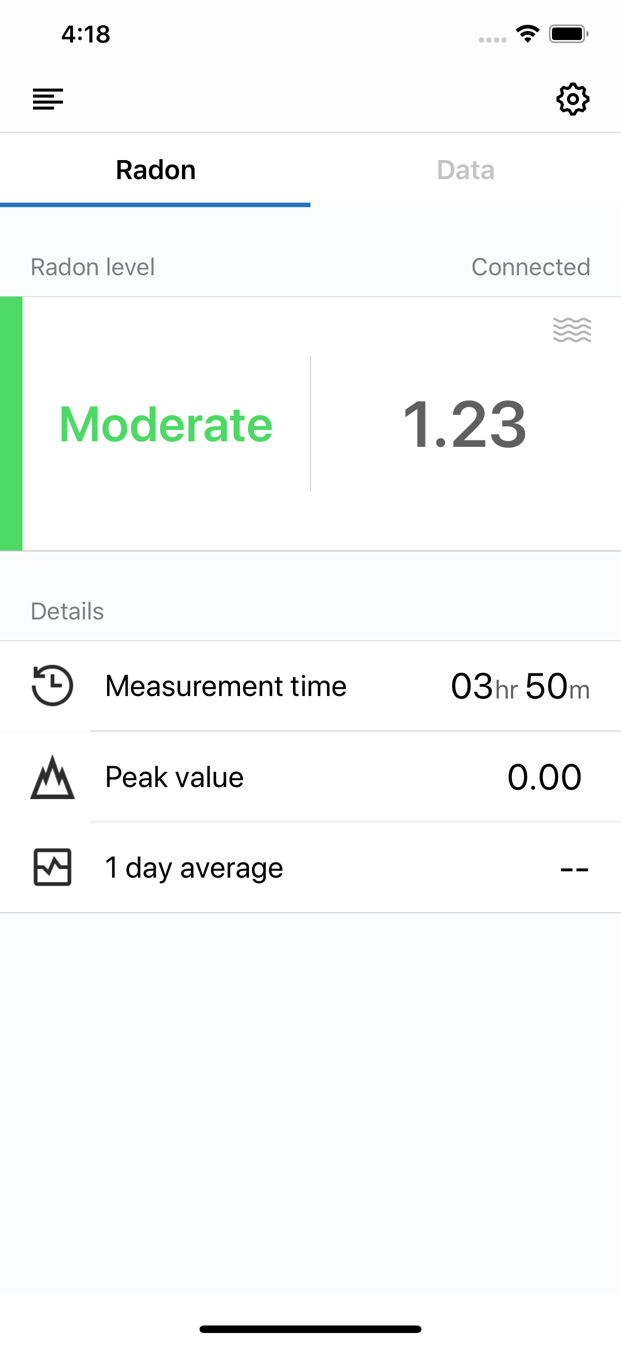
It's a great app and great device, but I can't for the life of me understand what the "Data" tab is telling me. My radon alarm went off the other day and I wanted to know if it was just a one time spike or if it was a long term trend. So I went to "Data" and waited a minute or two for the data to refresh. Then when it loaded, the x axis wad "# of data points". What does that mean? Am I looking at a day worth of readings? A month? I don't know. It would be really helpful if the x axis on the "Data" tab was time instead. Also, I like how the chart shows the "alarm value" but the data is all over the place. Instead of showing 9000 data points, could you show an average reading or something?


