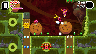
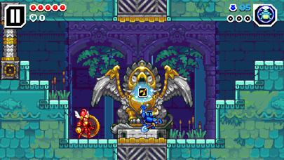
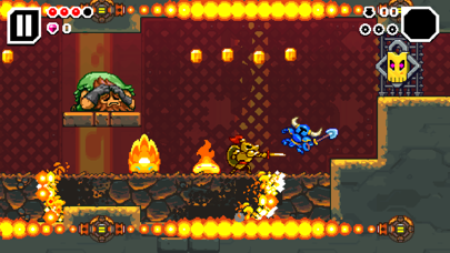
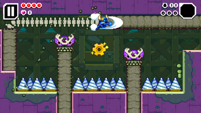
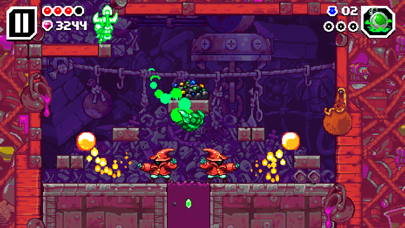
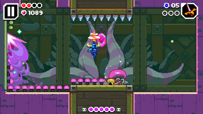
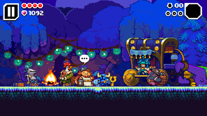
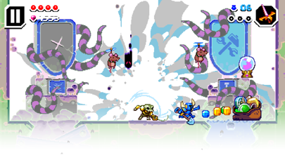
Please, please PLEASE do something about the touch control layout.
It’s too tiny, very very hard to aim down to shovel or control when trying to navigate the dungeon and especially in sections that require such movement. I would seriously like the Layout be fully customizable and not just…make left and right bigger or smaller instead of “englarge/Shrink” certain direction buttons. Please, game is great (on PC and Consoles) but this scheme on mobile is just…why? Especially on small or very large phones where it’s just not possible to move these in a comfortable position. I would really like them to just fix this design so it’s better to control and less frustrating for mistakes.


