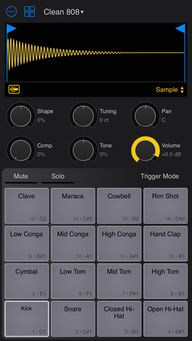
The user interface is clunky
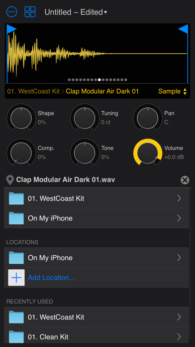
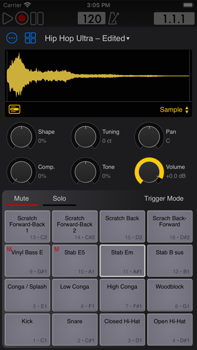
This is a nice app that I see myself using. However, the only way to hear the sounds before you add them is touching the tiny icon next to it, and it is VERY small so I keep adding samples accidentally. Also the icon touching area does not go over to the edges of the rectangle it is in, so you have to REALLY target it. Otherwise if you touch any small space around it, that means you’ve once again mistakenly added it. So frustrating man… Dear developer, one of the most frequently done actions in these type of apps is testing the sounds quickly and deciding on one. This should be much easier and much “safer” to do. Once that decision is made, adding the sample is easy, and does not really deserve the entire space where the text is. Please make the interface more intuitive. Make the icons larger or wider.


