Bad UI design on iPhone Mini models
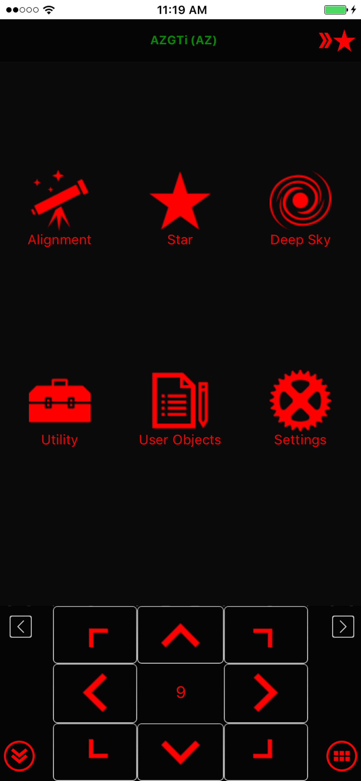
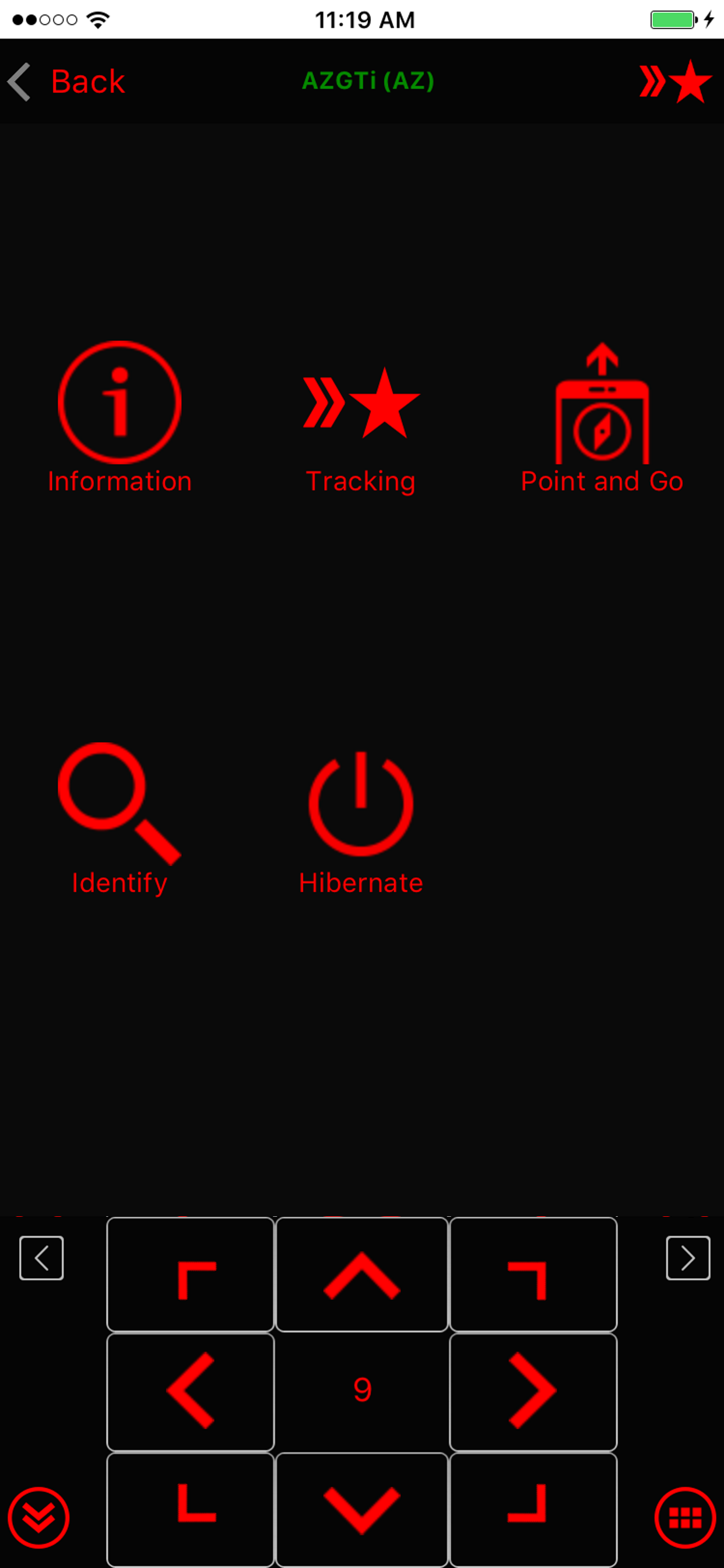
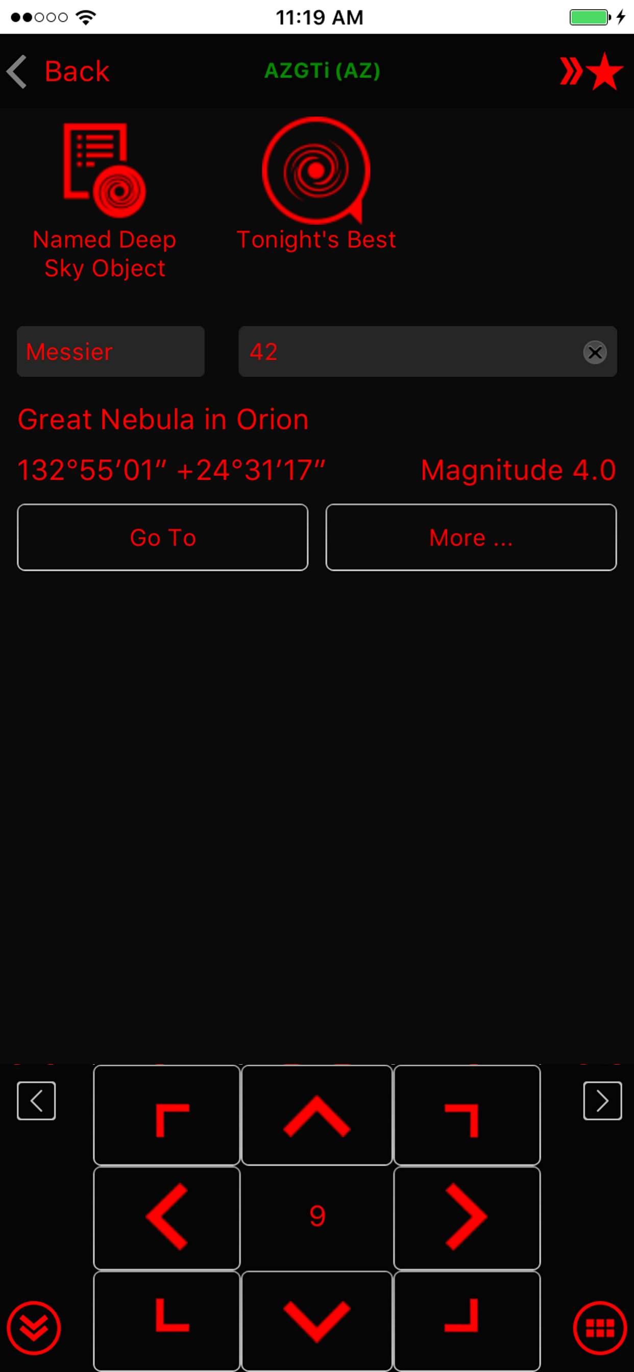
On iPhone 12 Mini in dark mode there is a bright light line around the notch. I did not experience this issue in other apps per with using larger iPhones. This UI behavior is not good for the dark adopted eyes. Also screen elements are overcrowded in the lower segment: telescope control is almost out of the usable screen area, overlayed with the home swipe line. Unfortunately all of these issues are here since introduction of iPhone Mini series, which happened 2 years ago. Please update the application with a fix.


