Poor user interface
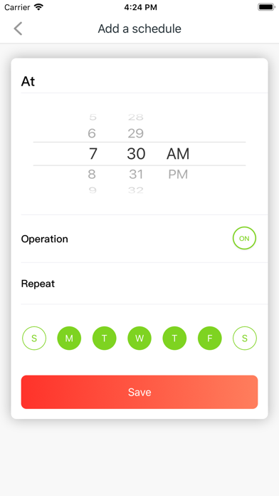
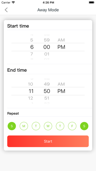
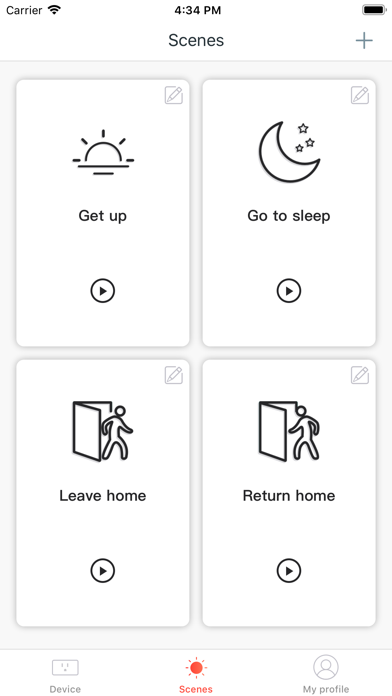
The latest update of Beli has unfortunately taken a step back in terms of user experience. Setting up a routine or scene, which should be a streamlined process, has become a cumbersome task. The interface, once intuitive, now feels cluttered and unintuitive. The lack of clear instructions or support exacerbates the issue, leaving users to fend for themselves in a labyrinthine interface. In essence, the app’s core functionality – to enable users to create scenes and routines efficiently – has been overshadowed by a poorly executed user interface design. It’s a classic case of an update trying to fix what wasn’t broken, only to break it.


