Poor smartwatch display
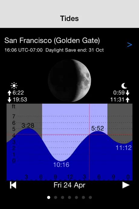
A great app on my iPhone, and handy on my Fitbit - but the colours chosen (black writing on dark blue background), and the small font sizes used, make the app more of a gimmick than a useful tool. I’d suggest the developer get real world experience with using the app on their smartwatch while on a beach - then make it more real world readable


