Idk
Contacting public safety is a little slow… responding with them is slow.


Yes, Tigersafe - RIT is completely free and it doesn't have any in-app purchases or subscriptions.
Not enough reviews to make a reliable assessment. The app needs more user feedback.
Tigersafe - RIT is free.
To get estimated revenue of Tigersafe - RIT app and other AppStore insights you can sign up to AppTail Mobile Analytics Platform.

Contacting public safety is a little slow… responding with them is slow.
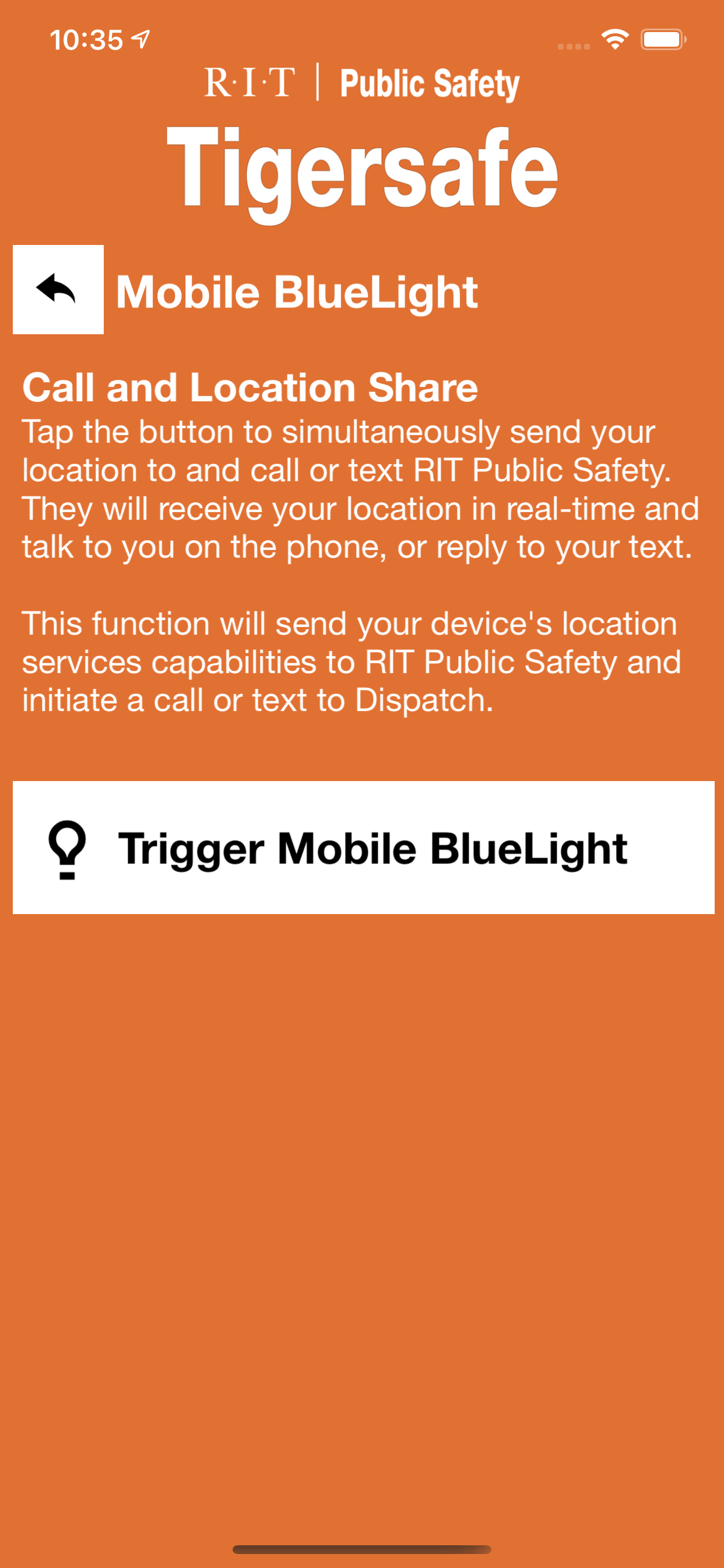
I really like the flashlight feature. It makes it super easy to turn the flashlight on my phone on. All I have to do is open the app, navigate through 2-3 pages, and click the flashlight icon… and voila!! The flashlight on my phone turns right on. Very convenient, would recommend.
When I first started at RIT, the version of TigerSafe we got to use was amazing. It was a student project that combined technical expertise and thoughtful, sensible design to produce a native iOS application that was pleasant to use and simple to understand. Then that student left and didn't give Public Safety control over the project, so they had to replace it in short order. The 3rd-party contractor that provides this app (AppArmor) is apparently the gold standard in public safety apps for campuses. The bar that AppArmor sets is so low that you would be hard pressed to even trip over it. Before I get to my criticisms, allow me to remind you that a public safety app is designed to be used infrequently, usually by people who are experiencing a severe problem. People in this state of mind fall back to quick assumptions, and often fail to comprehend complex paragraphs. They are trying to find the thing they need right now, and having to search for it makes their panic worse. This version of TigerSafe is not suitable for use in panicked conditions. First of all, it's hideous. It's even worse than the RIT Mobile app, which is not a target you want to shoot for. The main screen's color pattern makes it look like a prototype sketch that was copied too literally. The graphic at the top of the main page is also not sized for Retina displays, so it looks gross unless you're on an iPhone 3GS. Secondly, the UI moves after the app starts. To borrow a term from John Gruber, a dickbar pops up a second or two after the app launches, forcing everything below it to slide down, proudly proclaiming "Welcome to TigerSafe!" Why do I need to be welcomed? Why does welcoming me require that you move the buttons around under my fingers? The whole point of this app is to help you in dire situations, and moving the buttons right before you tap them isn't going to help you. Finally, there are paragraphs of text everywhere. Nobody is going to read your paragraphs of text when someone is having a heart attack on the ground next to them. They want simple, clear steps (or ideally, a single clear step) that are reinforced by the design of the app, not a report explaining how to do the thing they want. There's also a baffling anti-pattern of having a button that looks like it does what you want, but actually takes you to another page, which explains (with far too many words) what the button does, then offers another button that actually does the thing you wanted. How about you just
