Love where it’s going, but…
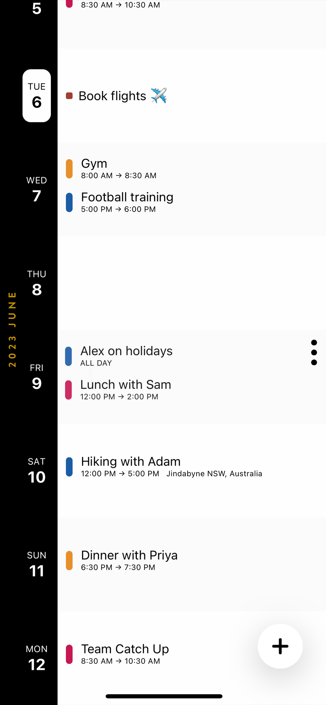
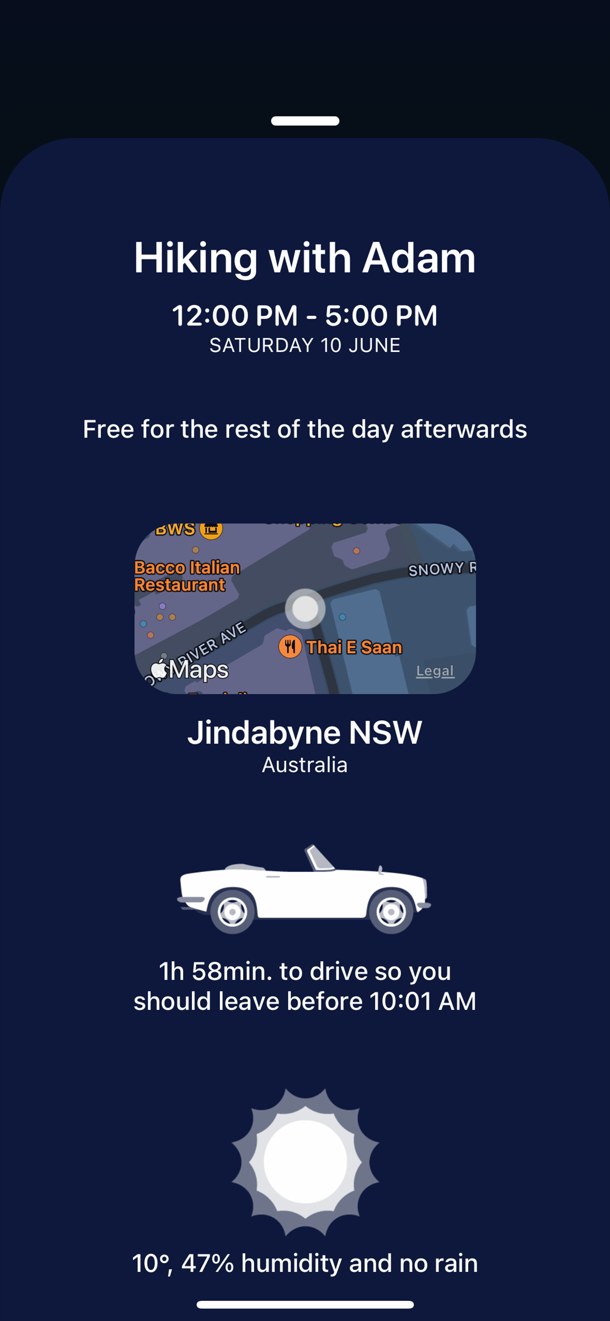
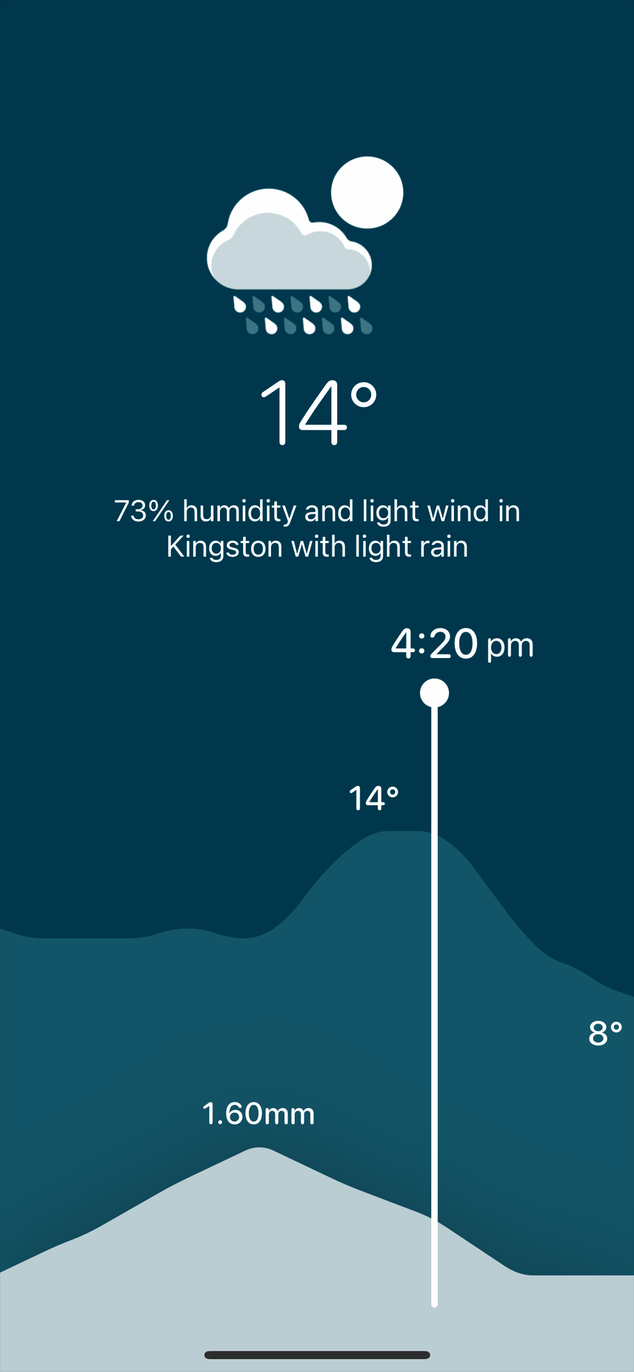
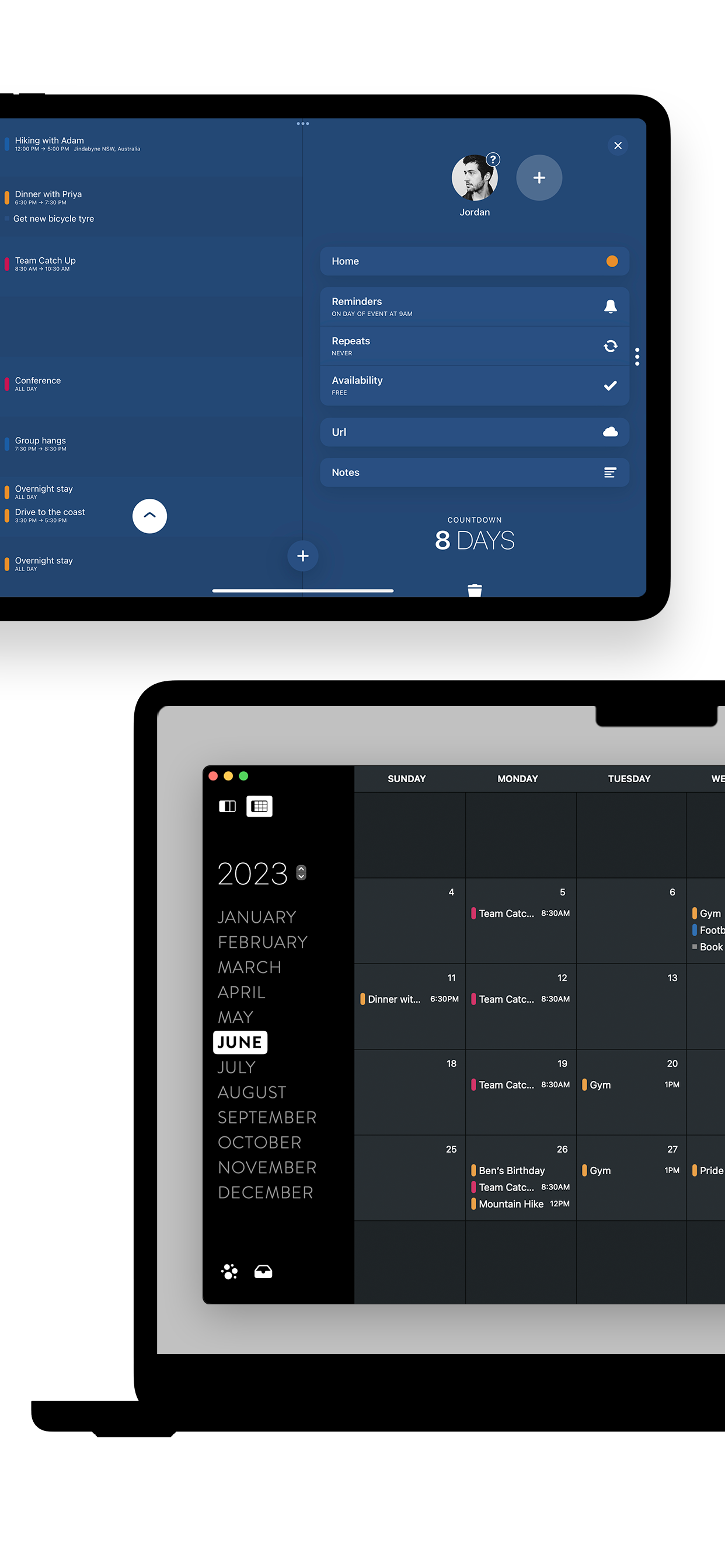
As I move through feature after feature I am blown away. It is like someone read my mind and created a great UI. Easy to read. A wealth of information that doesn’t feel like overload. Views that are so easy on the eyes. Simple navigation between days and months. Tap a day looking at months and the events appear right there. No moving from different views to see everything. That said, there are still significant bugs and usability issues. Multi-steps for entering event information, multiple taps for accomplishing actions. It’s so close but not there yet. You should be able to enter all event info in one step on one screen. The secret of a good UI is minimum clicks/taps. I will check back periodically to see if it has improved.


