Add button confusion
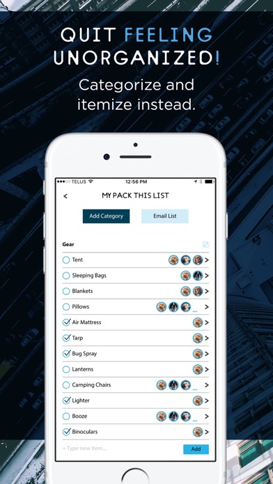
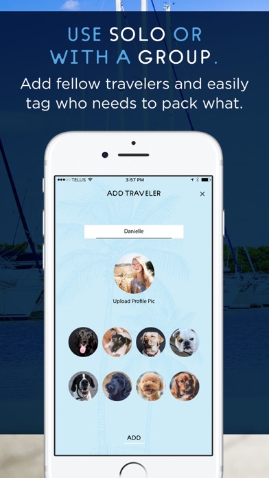
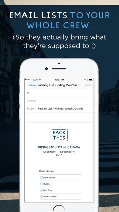
When you have a dark button on the right side, it implies that that is the next action that you need to perform. So I get hung up every time I want to add something and then it tells me I have to go back and type something first. to help with this confusion. Make that add button disabled until something is typed in the text field. Also, it would be nice to add multiples of the same object. For example, when I’m packing for a trip that is seven days, I would rather add “socks“ and then dial up a counter to seven. Rather than adding socks seven times, or having to type “seven pairs of socks”.

