Great magazine, TERRIBLE app!
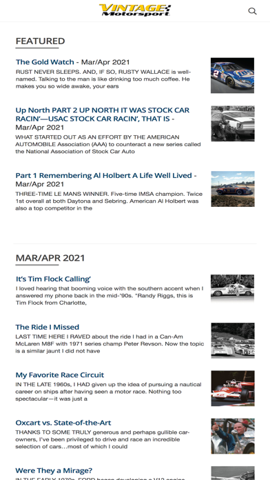
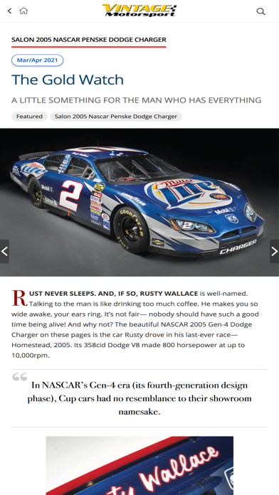
A magazine reader app really should be about the easiest app on the planet to create. Take your magazine pages that were created digitally in the first place and render them in an app. Up until now RACER Magazine had the worst reader app in the business. Vintage Motorsport just surpassed them for the title. Where things really go south for a publisher is when they attempt to “digitize” the magazine for digital consumption. This usually entails multiple reading modes, separate columns for articles, etc. etc. DON’T DO THIS!!! Just give me the digitally rendered pages as they appear in the print magazine that I can read, zoom in on, etc. It’s really that simple. This one fails right from the get go. When you open an edition of the magazine all of the articles are shown in thumbnail format in a column on the left that literally takes up half the screen. The articles in their entirety then appear on the right half of the screen. Pictures are clickable but don’t usually view correctly. You have the option of going to “page view” which SHOULD render the pages identically to the print version. It works, but only sometimes and it isn’t full screen. Half the time only a portion of the page appears. Switching back and forth between portrait and landscape once or twice can sometimes remedy this apparent bug, but every time you switch between the two it defaults back to the two column mode so you have to re-enter page view mode. Failing that you must shut down and restart the app and hope for the best. If you can eventually succeed in getting the entire page to show, zooming in and out is iffy at best. If you zoom too far the text gets blurry and hard to read, and sometimes the app will just randomly pop back into the default column mode. And the zoom point should be exactly where you start to pinch your fingers apart, but it isn’t. It moves around randomly and once zoomed in you then need to move to the correct point in the text. This is all COMPLETELY UNNECESSARY! If you just render the pages digitally to match exactly what a reader would see in the print edition, and allow for quality zooming, you’ve got a winner on your hands. Ensuring that the app remembers where a reader left off after closing and reopening is also table stakes for a good app. The ability to bookmark pages for later reference should also be included. Anything beyond that, including multiple reader modes, markup capability, page sharing, etc. just isn’t necessary. If I want to share something


