


Not very intuitive
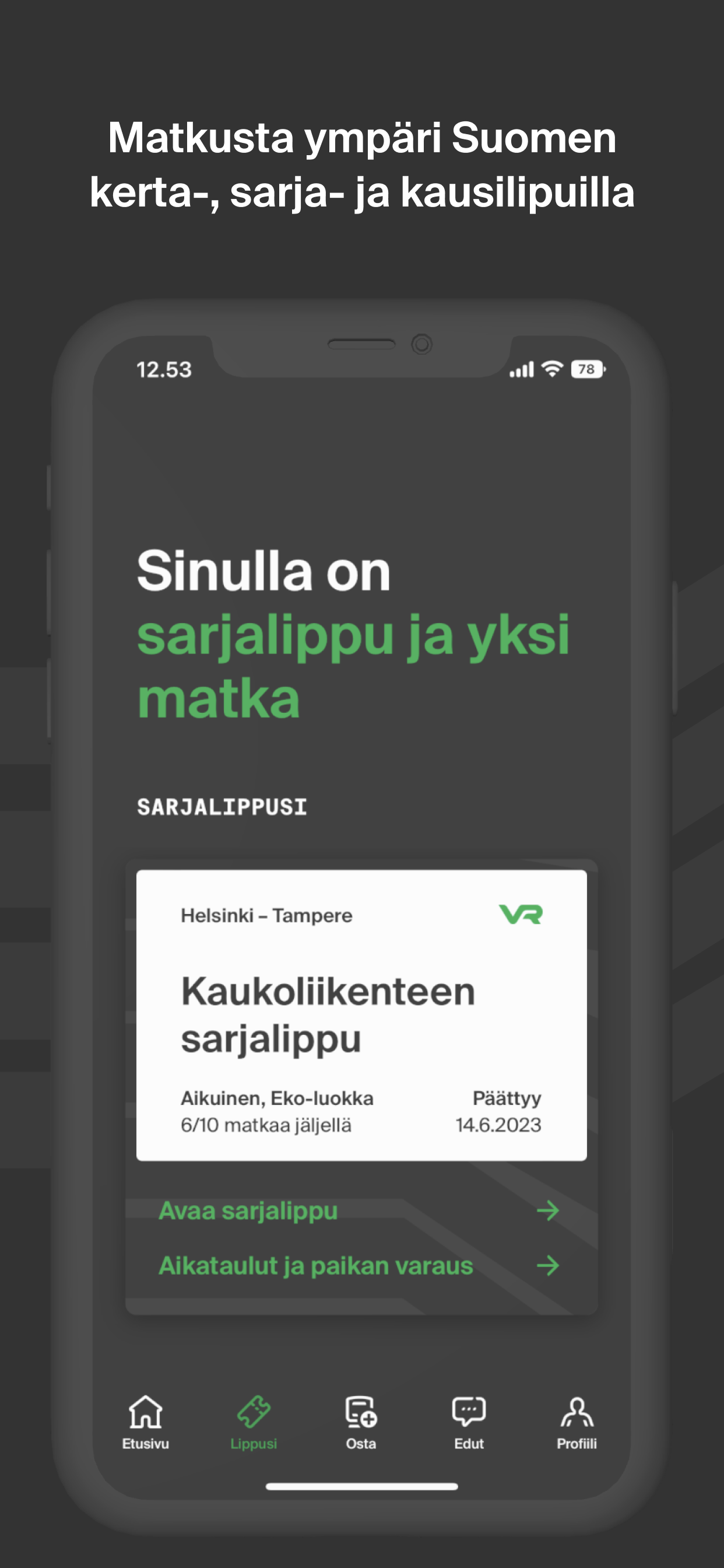
Several improvements: 1) show the direction of movement of the train on the train map when booking a seat. That will help a lot of travel sick people. 2) the ticket menu could be improved. It would be more intuitive to click on the « white piece of ticket » to show the ticket than doing Show journey and then Tickets. I got stuck in front of the conductor stupidly clicking on the white ticket thinking it would show the tickets… turns out it was easier to go on the home menu, and then there was the summary of my journey with the ticket button on the upper right. This brings me to the 3rd improvement 3) the home menu isn’t really a home menu. Once you have a ticket bought, the home menu becomes a « journey menu », which is annoying because then to see the timetables, you need to go on the buy menu and click on one-way ticket to have access to the timetables. Maybe change the home menu to « timetables menu », ticket menu to « journey menu » (so the home menu once you bought a ticket). It would be a bit more intuitive. Disclaimer: I’m used to the Swiss SBB train app, if you need inspiration for a more user-friendly interface, don’t hesitate to download it and play with it :)

