Touch controls could improve and bugs on community builds viewer
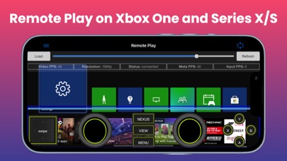
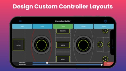
When using touch controls, they end up convering a big part of the screen. I would suggest making the buttons transparent & allowing the ability to control the opacity of the buttons. There is a bug when trying to type anything inside the Community Builds tab. You can't write anything even when it comes to naming a saved community build. A bug reporting feature would also be appreciated.

