Needs some design help…
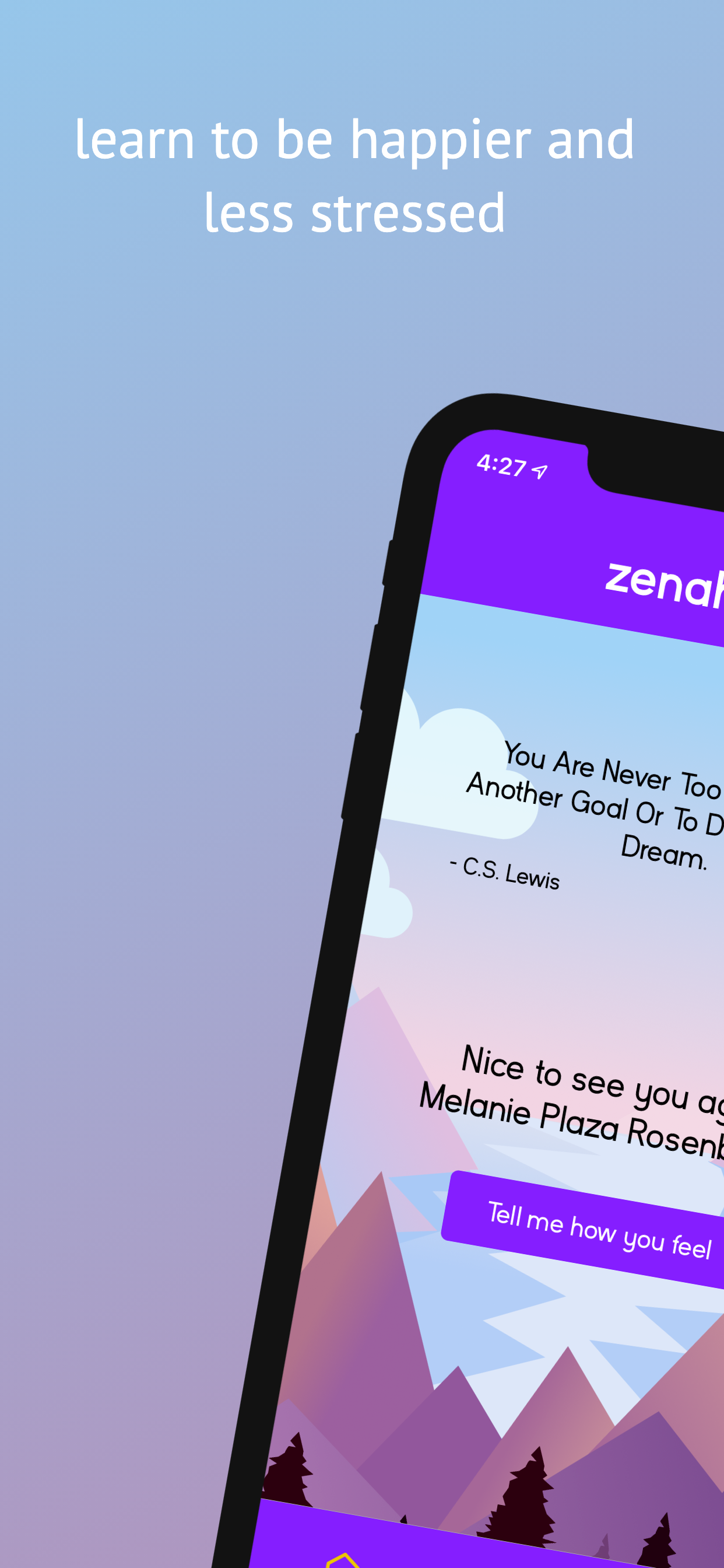
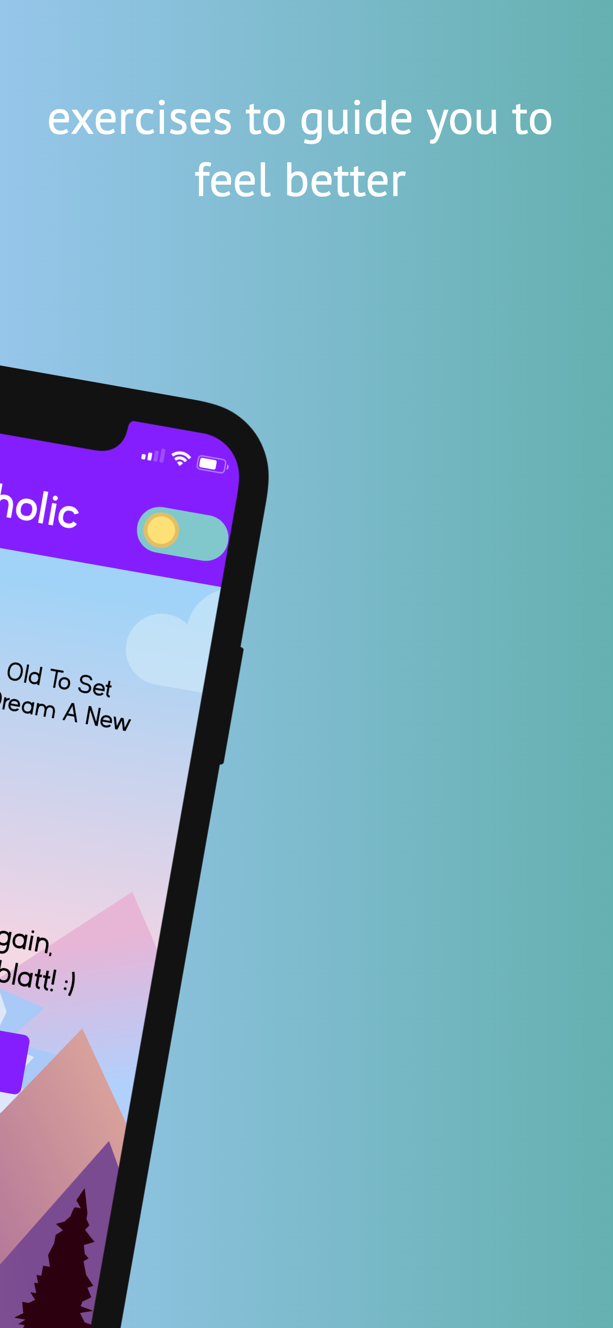
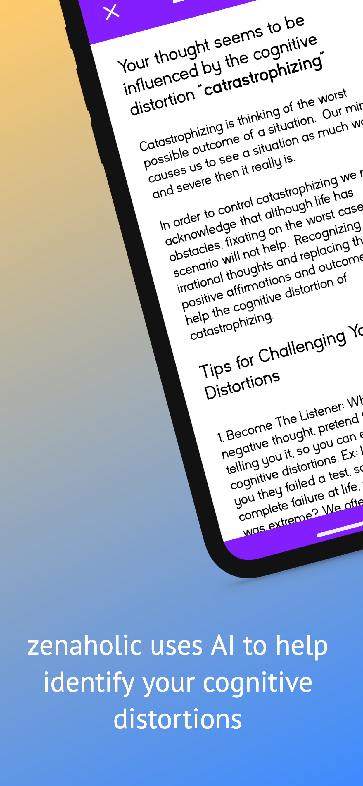
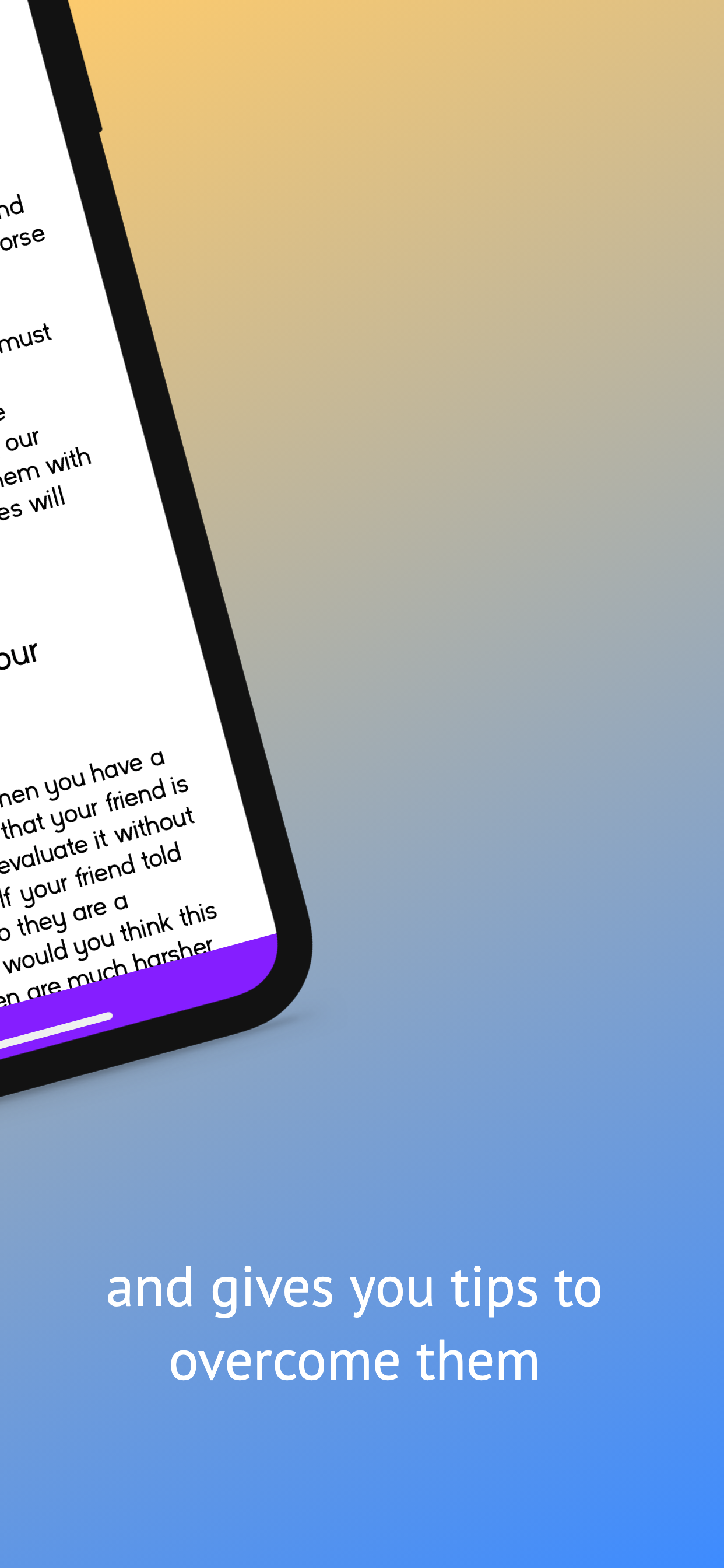
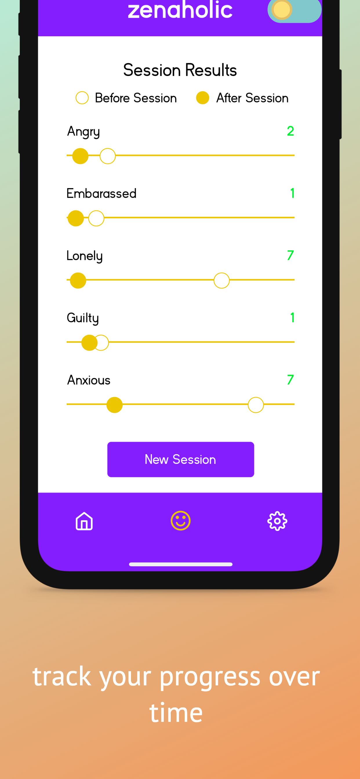
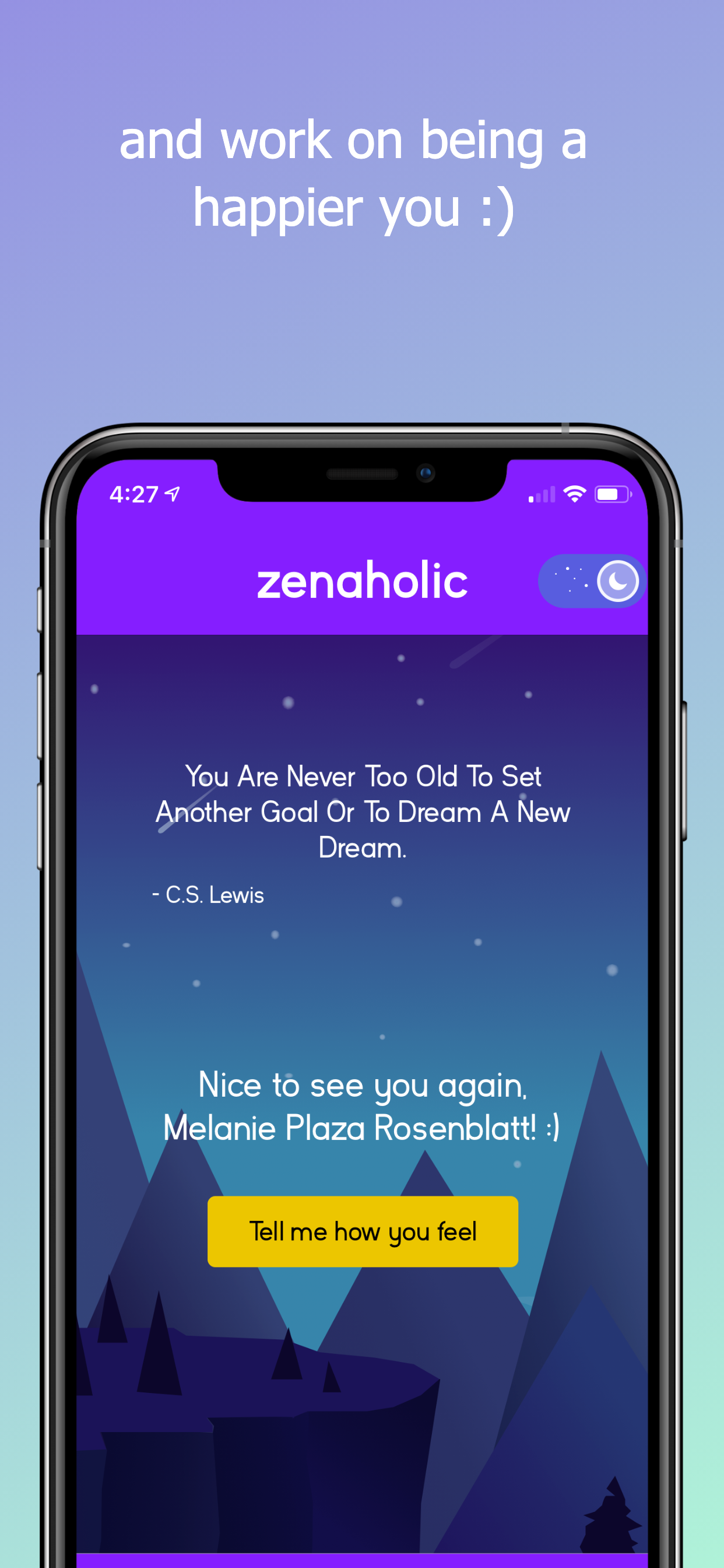
I enjoy the concept of this app, and have benefitted from CBT in the past. Zenaholic aims to use this therapy module to help users challenge negative beliefs. However, the app is not optimized for wider phones which causes scaling issues with the background and the animated assets are visibly static in the margins. This is not a major issue but a bit distracting. On a more user-experience note- I wish the text was scalable (to be bigger) or broken into smaller chunks with pictures. After one negative entry it felt overwhelming to be confronted with so much text and a numbered list that felt uncomfortably long for an app with minimal aesthetic. Hopefully this app will continue to develop as it is a wonderful idea!

