Foregoes function for aesthetic
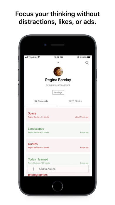
Not sure why this app is trying to pass bad design as stylish. The UX really needs improvement, esp the login page. There's no place that addresses "forgot email or password". I've made multiple accounts just because going thru that recovery process is so troublesome, and making another account is already so so troublesome. Then there was an issue where it said to verify my email but when i tried, it said there was an error and to contact the support team. From what I remember, there's some interesting content but wow the entry point is really pulling this app into the dirt. Also, the navigation was not super clear and it's confusing how one should go about using this app, even with the tutorial in the beginning. Seriously consider investing in building out a better system because it's truly not working.


