Request
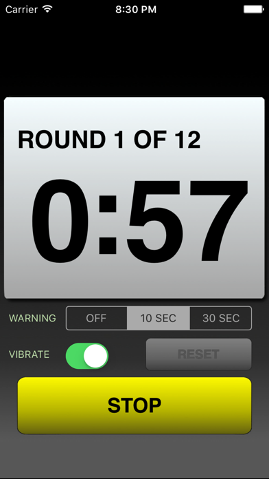
I hope the app developers read this. If they could make the “rest” round timer change to the colour red and underneath the round heading it says REST ROUND or something like this. So it’s clearly distinguished between rest and work rounds. Otherwise I love this app I use it all the time.


