Very poor
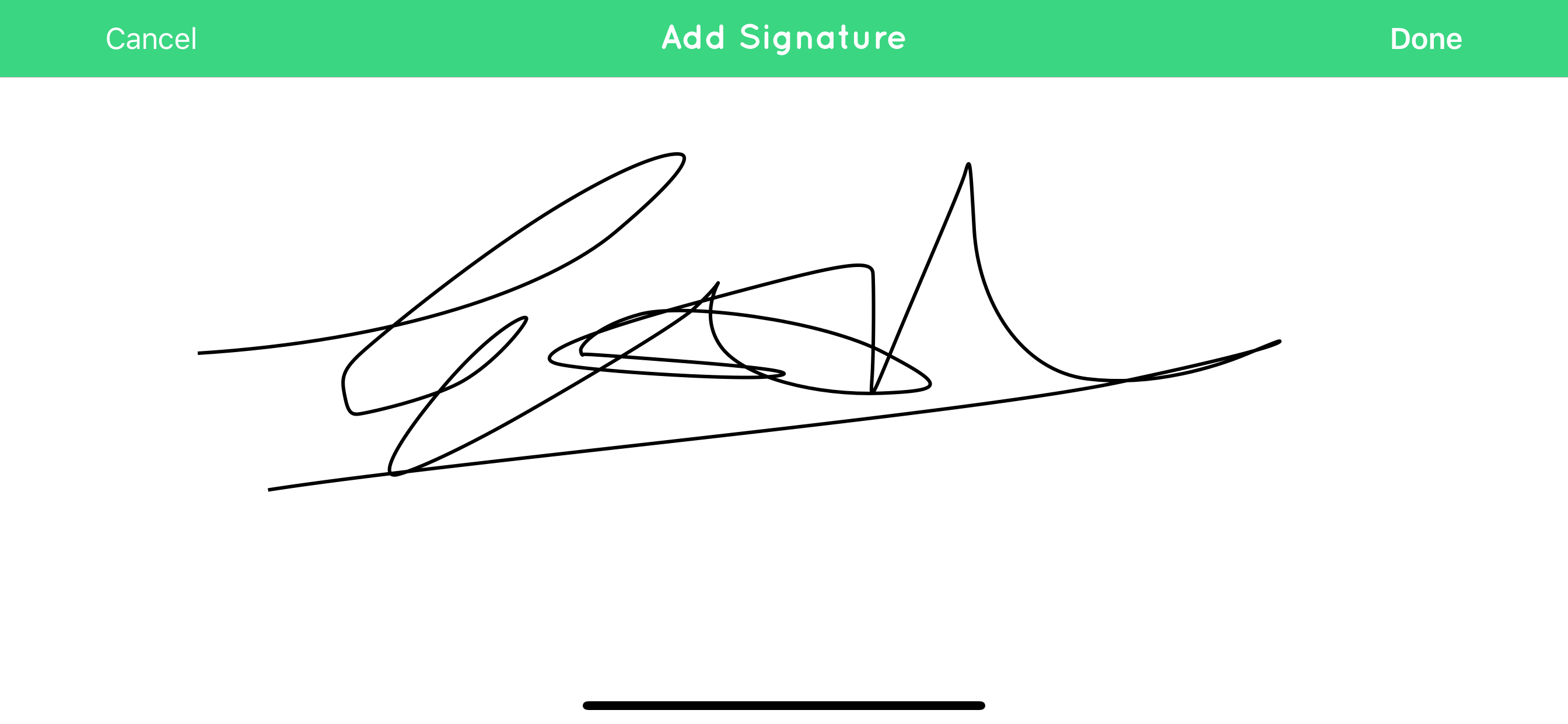
It could be much better. Why when adding times to a job is the time (or date) button tucked away at the bottom right hand corner of the screen. It’s hard to press even with a small finger. Put it in the middle and make it bigger please. Keeps loosing data and signatures, so I have to enter all the details again. Lost signatures can not be redone as I have left site. Very frustrating to use.

