Dreadful update after years of good use
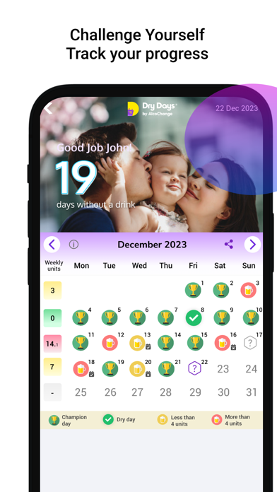
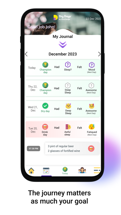
Dry Days - what have you done? Your beautiful easy simple to use app has been ruined! The grid has shrunk to half the size it used to be. It now fills less than half thr screen of my iphone 14 pro, while much of the rest of the screen is empty. What a total waste of space. Guess what? I don’t perfect eyesight and I wear glasses , so you just made your once brilliant app much harder for me to use Why did you do that, shrink your user interface, reduce my user experience? Your designers clearly do not understand how UI UX works and how important use of eyes and fingers are on an iphone Plus why only small 125ml or large 250ml glasses of wine? you need to add medium 175ml. And why only 12% regular or 18% fortified? Most UK wine is 13-14%. Do you actually understand wine? Please bring back the best features of the old app that made it so easy to use. Thank you.

