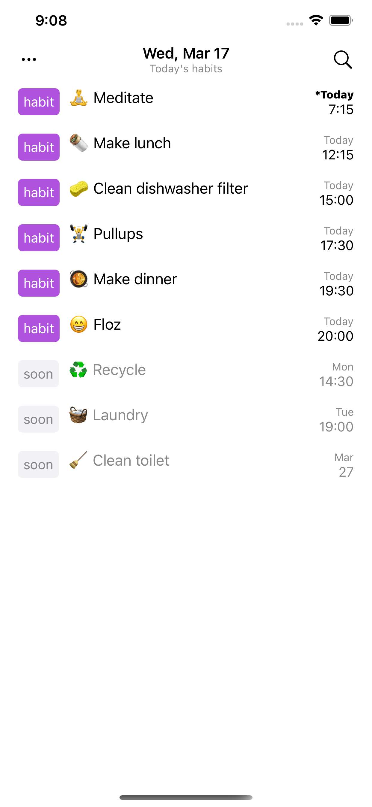
A habit tracker that gets out of your way:
• Set your daily or weekly habits
• Get notified when habits are due
• Use notification actions for quick access
• Review your day streak or commitment
• Search or filter habits
• Keep fully offline or save elsewhere
• Export your habit data at any time
• Set to dark or light mode
• iPad-friendly
Power users:
• Your habits saved to plain text
• Org mode (orgmode.org) compatible
• View and edit from your text editor: Emacs, Vim, VSCode...
• Share/sync file with your Mac or other iPhone apps
AusblendenMehr anzeigen...
Screenshots
Flat Habits Häufige Fragen
Ist Flat Habits kostenlos?
Flat Habits ist nicht kostenlos (es kostet 19.99), enthält jedoch keine In-App-Käufe oder Abonnements.
Ist Flat Habits seriös?
✅ Die Flat Habits-App scheint von hoher Qualität und legitim zu sein. Die Nutzer sind sehr zufrieden.
Danke für die Stimme
Wie viel kostet Flat Habits?
Der Preis von Flat Habits beträgt 19.99.
Wie hoch ist der Umsatz von Flat Habits?
Um geschätzte Einnahmen der Flat Habits-App und weitere AppStore-Einblicke zu erhalten, können Sie sich bei der AppTail Mobile Analytics Platform anmelden.
Benutzerbewertung
5 von 5
6 Bewertungen in Polen
5 star
5
4 star
0
3 star
0
2 star
0
1 star
0
Bewertungsverlauf
Flat Habits Bewertungen
Wonderful design choices make this app a joy.
This is exactly what I want in a habit tracker. The data is in an open format (org mode!). The repeating times are flexible. If I miss a specific time, I can still complete it before it recurs. It syncs with whatever backend Files supports. It’s absolutely perfect.
I wonder if changing a specific habit’s frequency could have a more elegant solution. Right now it warns you that it might affect how it is tracked. I don’t have a great solution to this UX problem. But it’s still a place where some clever ideas could make things just a bit better.
New to habits
I’m new to habits but what a great way to try with no overhead but great comfy features.
Simple and effective
No clutter really effective app. Great execution.
Simple, text file based 💜
I love the simple, no bells, no whistles interface. Marking a habit as done is easier than skipping it, as it should be. Because it uses a text file I can use Scriptable or Pyto to create my own widgets. Thank you!
Simple and effective habit tracker
Does everything I want it to
Total privacy, excellent features.
Really awesome app.
Simple yet effective
I’ve tried many apps in this space, but the complexity and time required for updating the habits was not worth the time. This app does one thing and it’s simple!
Simple and beautiful
I really like the idea of having my habits separated from tasks/todos (see plainorg by the same dev). This app just does that and has a historical view with the calendar along with streak and commitment metrics which is a nice touch. It’s a simple, intuitive, and beautiful looking app.
Focused and excellent
I use this every day and I works really well. Focusing on a small subset of orgmode functionality for mobile is perfect, since it lets the app avoid clutter and give you what you’d want in this form factor anyway.
Would be an ideal app with some UI adjustments
Largely smooth sailing once you get the app set up! If you can't make habits with this app, it's not the app at fault. We all know the struggle. ;)
Here are some places even more friction could be removed:
- Don't let me dismiss the editing modal by mistake and lose my work. I tapped in the empty space to dismiss the date picker, not the whole modal. A Save button wants a Cancel button. (Automatic dismissal is still OK so long as no uncommitted changes are prepared yet; check the Calendar app's new event modal for an example.)
- Present the editing modal in a plain sheet in order to hold its content still. Today, focusing the keyboard pushes it up, then selecting the date drops it down again, and it bounces between positions.
- Thanks for honoring Dynamic Type settings, but please support all sizes. The editing modal's content overflows the screen at the largest standard size, even without enabling accessibility sizes.
- Baseline-align the text in the habit table cell, from the marking button to the title's first line. All the lines implied by object edges and text baselines add subtle cognitive load. Alignment results in fewer lines in total and more comfort for users, and it's an easy way to make things look professional.
- The context menu is the only way to access Edit, Skip, and Delete. This is undiscoverable to iOS users because we don't think we have to "right click" things. With the exceptions of the home screen, scrolling, and pinch to zoom, gestures and context menus are expected to be extra shortcuts, not the sole way to do something. You could show those functions elsewhere or train users to tap and hold. Consider adding a standard Edit button to the table view to change the tap action to Edit and to reveal Delete buttons.
- The New Habit and View items in the corner menu would be great to have on screen as a "+" button, a segmented control for the two view states (see Recents in the Phone app). The rest of the items seem like they belong progressively disclosed as they are. "Other stuff" menus aren't that weird on iOS, it's just unexpected to hide the functions that are normally readily at hand.
Gewinnen Sie wertvolle Einblicke in die Leistung von Flat Habits mit unserer Analytik. Melden Sie sich jetzt an, um Zugriff auf Downloads, Einnahmen und mehr zu erhalten.