The App meets quality like the board
The App is great, the session tracker also, please add some social aspects liking others sessions :) otherwise great app


Ja, Fliteboard ist komplett kostenlos und enthält keine In-App-Käufe oder Abonnements.
Nicht genügend Bewertungen, um eine zuverlässige Einschätzung vorzunehmen. Die App benötigt mehr Nutzerfeedback.
Fliteboard ist kostenlos.
Um geschätzte Einnahmen der Fliteboard-App und weitere AppStore-Einblicke zu erhalten, können Sie sich bei der AppTail Mobile Analytics Platform anmelden.

The App is great, the session tracker also, please add some social aspects liking others sessions :) otherwise great app
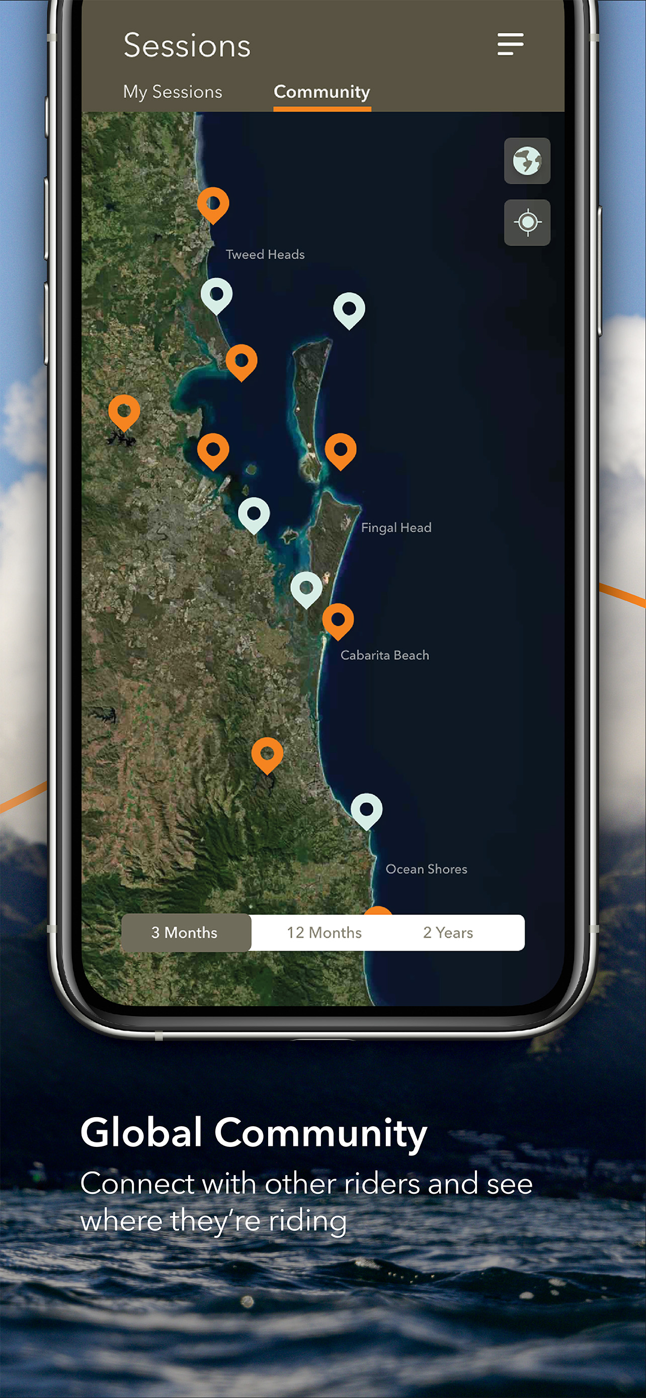
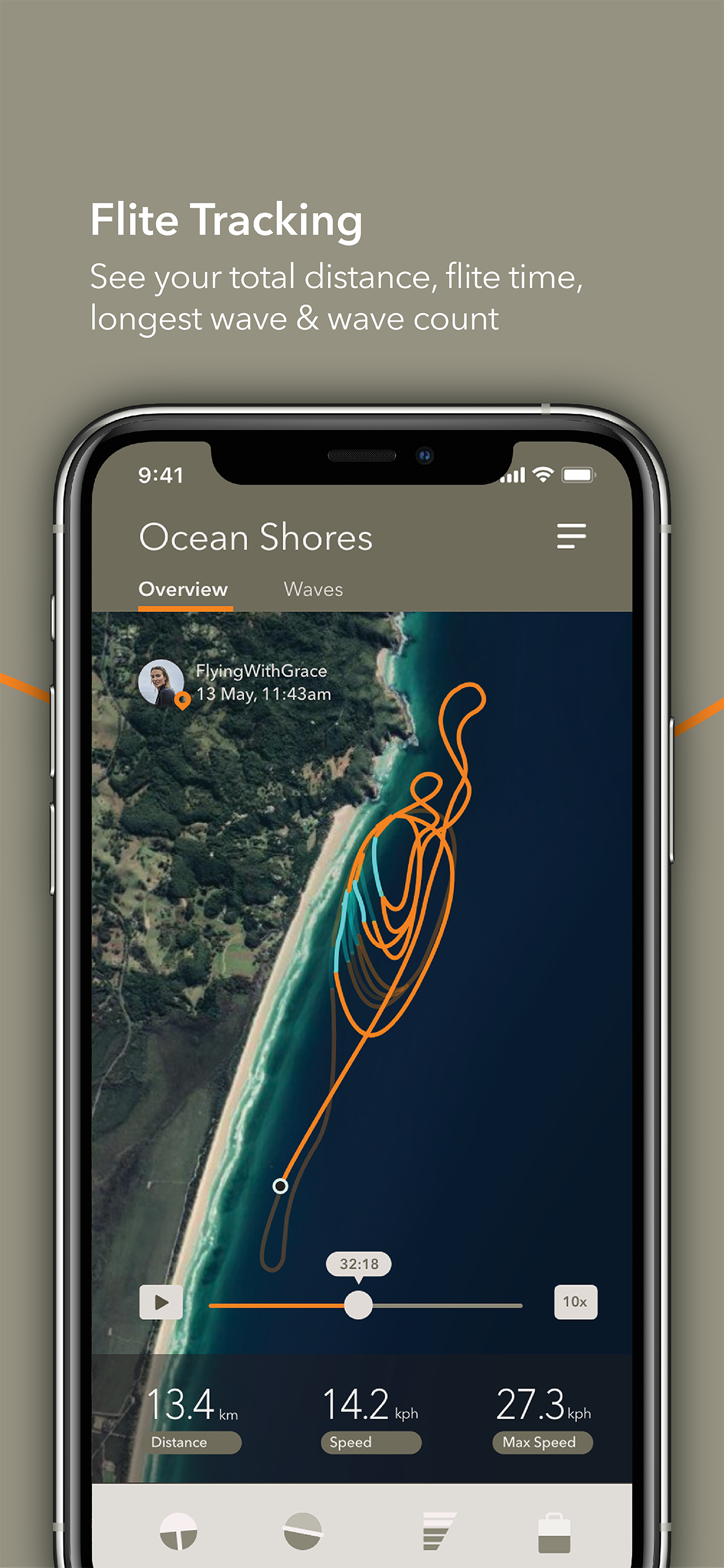
Guys the UX it absolutely awful! Lots of elements are behaving wrongly. You broke dozens of golden UI/UX rules and, most importantly, Apple Guidelines. The whole experience off using the app is annoying. That’s a shame that so wonderful product users have to use this app. Guys, you’re not a startup anymore! Hire good native developers (not cross-platform) and experienced mobile UX designer. It’s 2022. Not 2015. No one uses slide menu like at all for several years, especially when the menu button is on another side of the screen from slide menu itself. Community session screens doesn’t make any sense at all right now. Especially when defaulted to 2 years filter. It’s not informative and bulk because of amount or pins. Use clusters! You deleted a wonderful feature when you could scroll your session progress time on the playback and the result (orange line) was immediately visible. It gave the understanding how you or others ride. Now to see it I have to watch it at max 20x speed. When register your account, the text fields can not pre-populate your details. Including emails on the login screen. And password is not suggested. Which is literally a couple of code lines. Login screen and fill your details screen weirdly scrolling during text entry on big iPhone screens. Hiding needed UI elements. Use pleasant for human eye animation when update UI elements or fill the tables. It’s too jumpy. UI elements are great. But UX is broken completely. You’re making an app for people who are not poor and who’re expect a bit more quality product which matches the great Fliteboard hydrofoil itself quality. Disappointing… 1/5 stars just because I can’t rate it as minus 5. I hope you read this feedback and update the UI/UX bugs.
Do you think you may be able to have Strava recognise foiling as a sport on their App - like they do for SUP, surfing, Nordic ski etc??
