Small text, too many steps
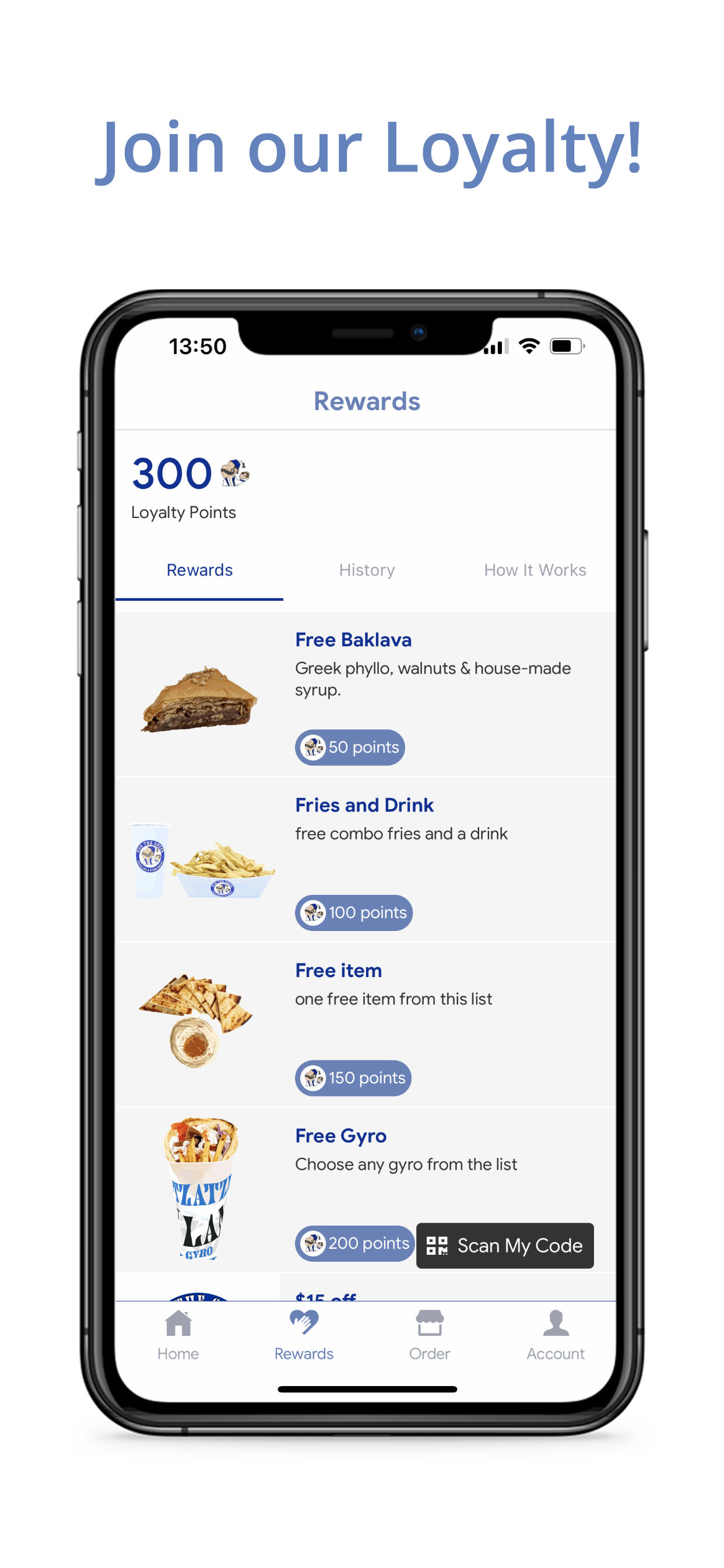
While the food is great, the app needs work. The text is too small, it doesn’t respect system text size. The font is also very lightweight on top of that, making it harder to read. This makes navigating, ordering and everything else more difficult than it should be. Orders could be streamlined with fewer pages to tap through to get to checkout. Again, finding the typeface could enhance readability here and speed the process up too. There are too many screens, the text is too hard to read and it is easy to miss things. Redeeming a reward is harder than it should be. It ends up that I have to add a new item to my cart instead of just discounting the one already in there. This adds at least 3 more screens to the order. The app doesn’t remember that I always use Apple Pay, instead it presents a credit card screen by default. The text in the receipt is also hard to read. There should also be either a map screen or link to the address of the store for navigation. A progress meter letting customers know when the order is ready would be nice too.


