A UX Designer’s Worst Nightmare
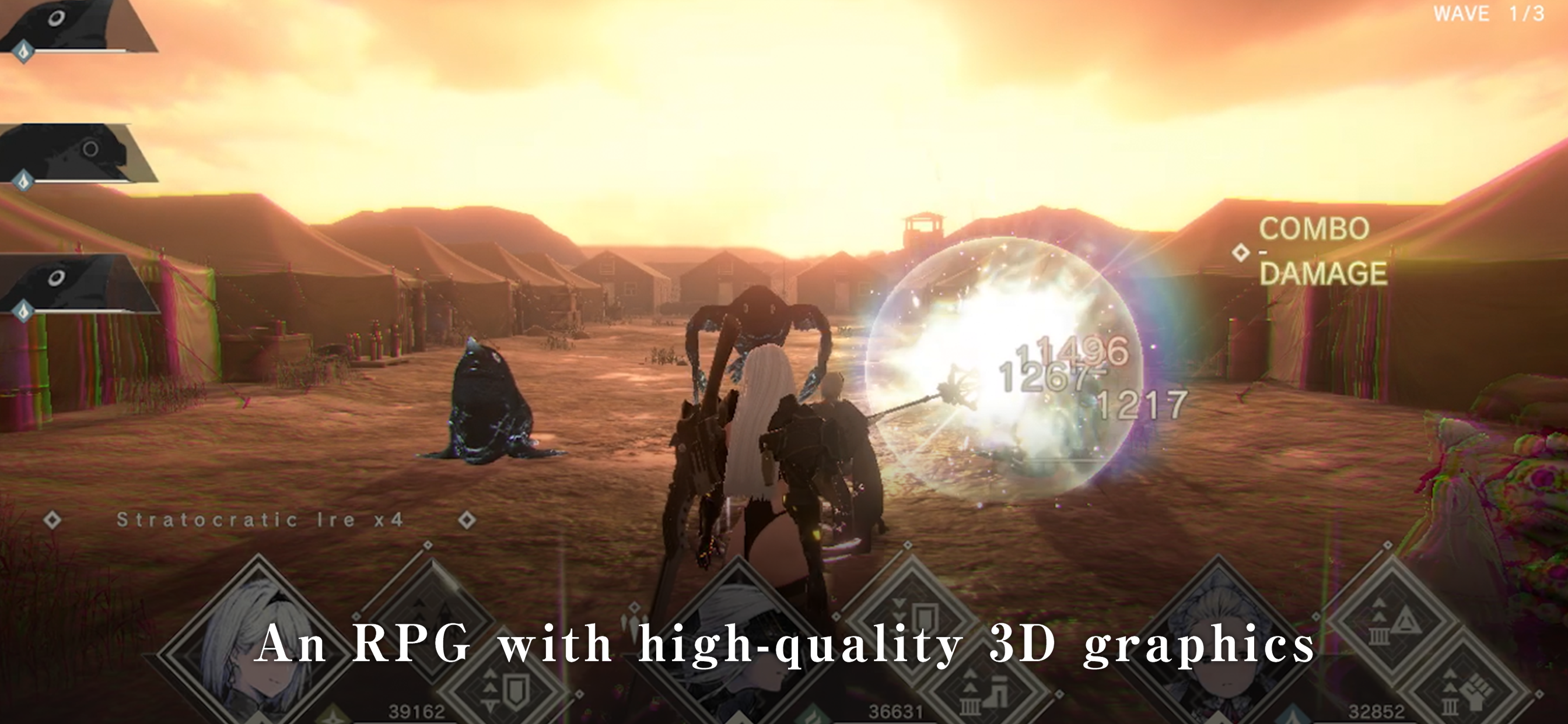
There are some good things with this game. The gacha rates aren’t that bad, and the cutscenes and music is really great considering that this is a mobile game. But this is all shadowed by the terrible UX/UI design. Navigating the menus trying to upgrade either your character or weapon is an absolute pain. There are multiple back buttons that bring you to different pages, but they are all on the screen at the same time. It is really easy to misclick and go back all the way, instead of just to the previous page. A search or sort option in the upgrade menus is needed when you get tons of weapon and characters. None of them stacks, so they are all spread out everywhere. Good luck finding that one new weapon you just got. It doesn’t seem like they are trying to improve at all. At least give us an option in-game to give direct feedback, instead of having to rely on the app stores.


