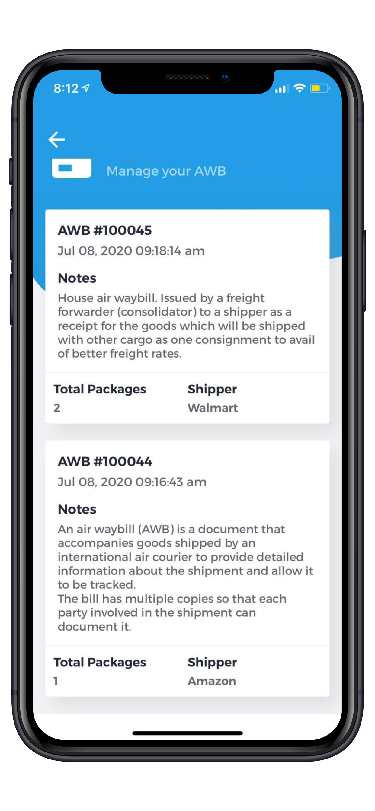
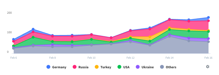
Low contrast headers / login screen = nay, nay, thrice nay!
Bearing in mind that this app is in its infancy... The login screen uses a background and font color so low in contrast that one is practically invisible on the other. The login particulars - username and password - seem to show neither actual typed character nor round dot to indicate “place” in pw or username, nor an option to show the characters being typed. Unless, of course, the same ultra-low contrast off white on pale gray is being used for text and background. Please, app developers, for the love of all that’s holy, pick a higher contrast pairing of font color and background for your header and login screen!


