The best app for a traditional feel, but a few improvements would be welcome
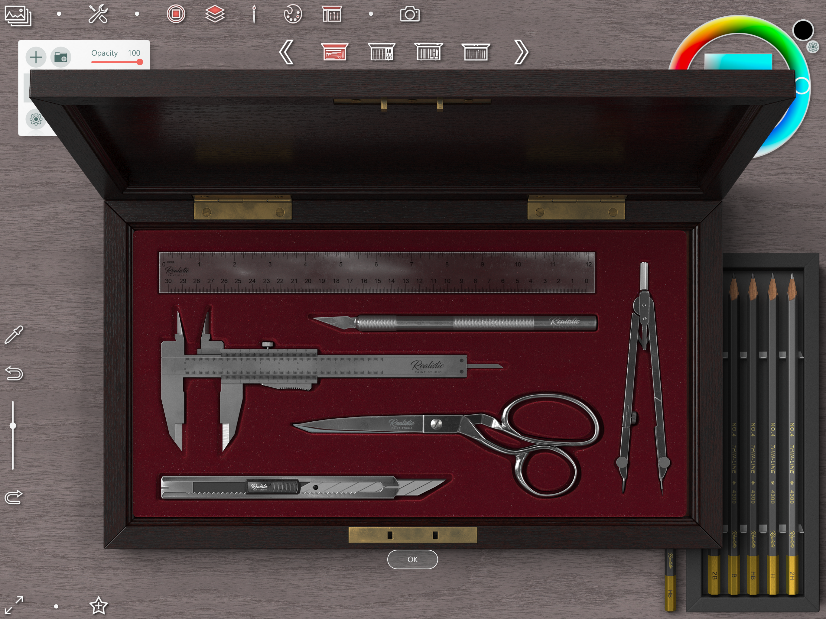
In terms of traditional feel, this is by far the best app on the market, and I've tried them all. However, there are plenty of things that could be improved. I bought both the PC and the iOS versions and, by comparison, I find the iPad one lagging behind a bit. A few quality of life changes would really bring both versions up to speed. Suggestions: 1. While putting tools in boxes is nice and all, it's really hard to switch fast between them, and a shortcut for this would be welcome (the Favorites toolbar can get messy pretty quickly, especially if you like a lot of brushes) 2. Having the Transform tools in a separate box is quite a bummer, please allow use of the lasso or other selection tools with a shortcut, just like you allow CTRL + T for transform. 3. If possible, please make a separate category for Blending tools and allow a separate shortcut for blending; 4. Speaking about shortcuts, I think this one could be huge: please allow change of shortcuts on the iOS version, just like you do on the PC version; having the option to set all of those is pure gold, since I use shortcuts for everything (still, a shortcut for the lasso tool would be very welcome on PC, too). 5. A more intuitive watercolor mixing palette would be welcome 6. More traditional tools instead of the glitter ones would be just as welcome Other than that, if you are looking for an app that feels traditional, at this point in time, you have no other options that come remotely close to this app on the iPad. Congrats and please do not migrate towards digital, like a lot of other apps do!


