Need to enhance the UI
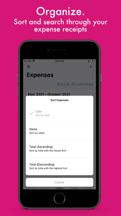
The overall function is excellent, but the UI design is a little bit confused. For example, I couldn’t find where to edit my expense. After several attempts, I found it in the share button. In the view of a user, the edit bottom is not expected to be hidden in the share button. Also, the position of “add” button is also strange: it’s at the top-right and is small. It should be at the bottom, parallel to the first level menu.


