Quite bad design
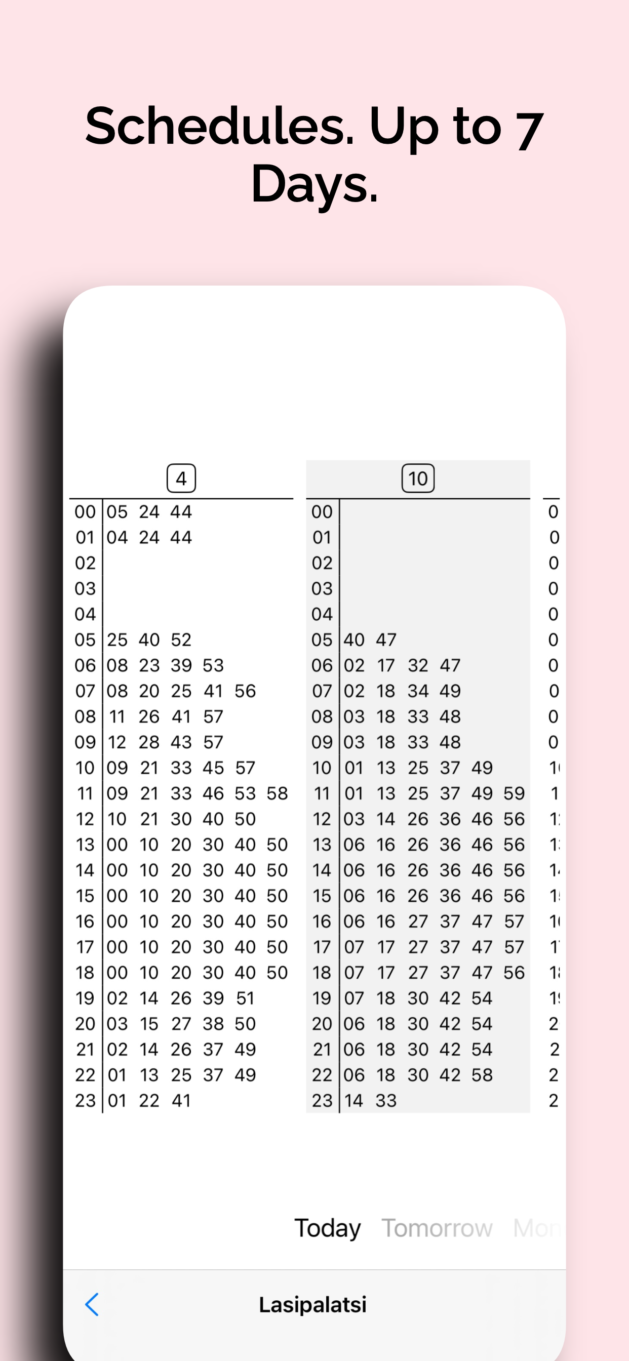
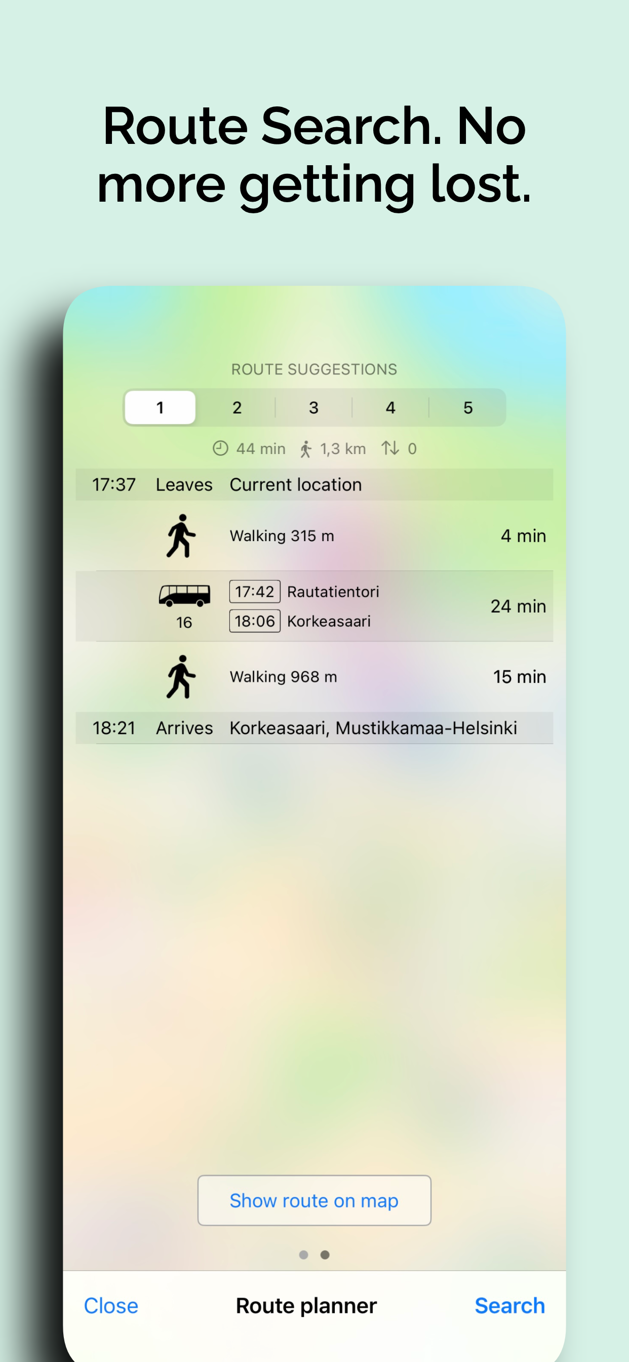
This app has many design and UX flaws and feels like maybe the developers do not use it. The navigation selectors are all at the top of the screen (and it’s winter 8 months of the year here so hands are already freezing). Swiping doesn’t work despite being the best way to navigate phone apps (especially with the electro gloves on). There is no setting for people who need closest possible station vs. shortest route (for example, mother with small children or a person with crutches). There’s no way I can get the app to show me the close stop to my house which connects via a different route instead of the .9km walk (which my mother in law can not do). You have to know the names of the place you want to go before you can get there. I have to use google maps to get my locations then come back to this app. You have to know all the neighborhoods of the city ALREADY to find out which direction a bus is going. So basically by the time I can use the bus system I don’t need this app any more. Several times I had to go into the paper booklet just to see the options on a specific line. There’s no option in app to look at a certain bus line (app always assumes you are mid journey and so it’s really bad at allowing you to research the best route among many others). There’s a bajillion other things but I’ll just stop now after the big ones. I wouldn’t recommend this app, but there’s no other one that has the data. (This has been a problem for about 10 years, ever since the bus companies or federal govt or somebody locked the data off of google maps).


